You do not have to follow these rules every time. If you have a good reason to break any of them, do. But they are safe to follow every time.
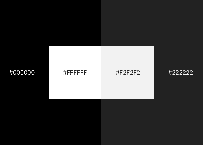
Pure black often has uncomfortably high contrast with other colours, and pure white is too bright. Use close-to-black and close-to-white instead. Any other references to “black” and “white” in these rules assume you’re following this rule.
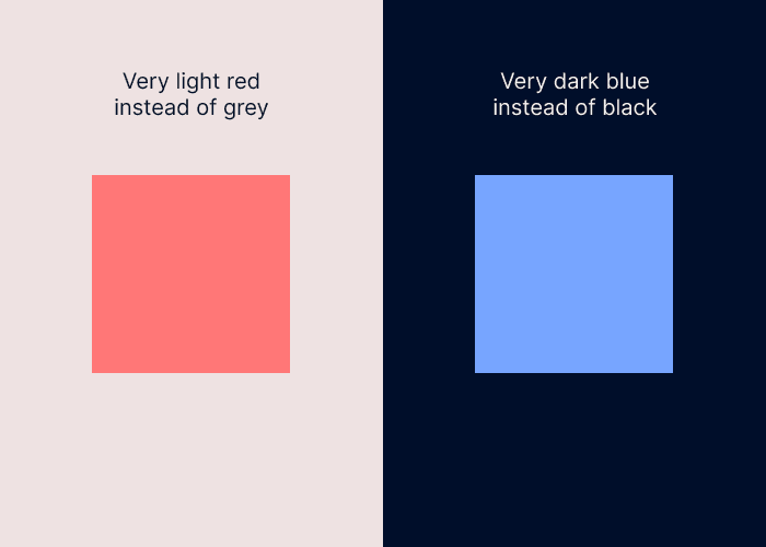
A neutral is generally a black, white, or grey. If you use colour in your interface, add a little bit of that colour to your neutrals. This will make the colour palette feel more coherent. If you use the HSB colour system less than 5% saturation should do it.
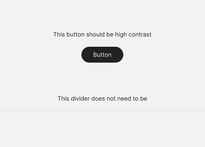
Important elements means buttons, content, or anything else that the user needs to notice. A higher contrast means that the element will grab attention, which is useful for important elements. Elements that the user does not need to notice (e.g. structural elements, drop-shadows) can use as little contrast as possible.
You should be deliberate about absolutely everything in your design. This means whitespace, alignment, size, spacing, colour, shadows. Everything. If someone points at a random part of your design you should have an explanation for why it looks that way. If you do not do this your design will not feel coherent.
If you are new to design you can use this rule as a prompt to learn more about what you are not deliberate about yet.
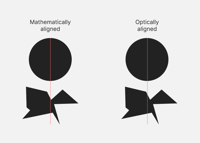
Your design software can align things mathematically. But some shapes don’t suit this type of alignment. For example, some odd shapes have a visual centre that is different from their mathematical centre. Often you will need to align things by eye so that it looks right.
It takes some practice to be able to align things by eye, but if you do it regularly you’ll quickly pick it up.
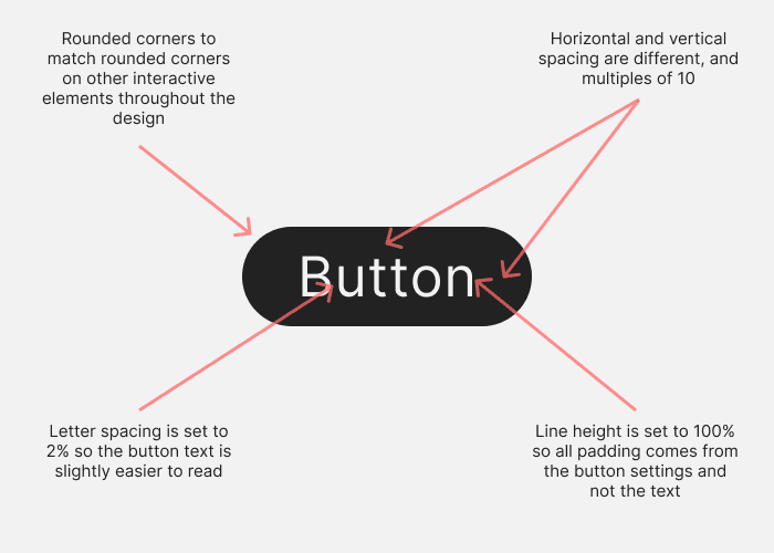
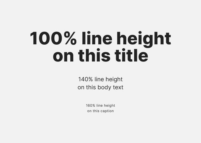
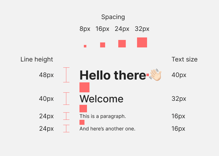
This applies to all text. The bigger the text, the less space you need between each letter and each line. The reverse is also true. If you do not do this large text can look spread out, and small text can look too close.
Example: If you have a card with a 1px border and a dark background, and it sits on top of an even darker background, the 1px border should be lighter than both of them. It should not be set to a brightness somewhere between the card and page background colours. Otherwise the edge of the container won’t look sharp enough. The same applies to light background colours: the 1px border should be darker than both background colours.
In the example below the left side is incorrect and the right side is correct.
Alignment helps us realise that things are related to each other. If something is not aligned with anything else, it feels like it does not belong in the design. Ideally each element should be aligned with other elements based on some kind of logic.
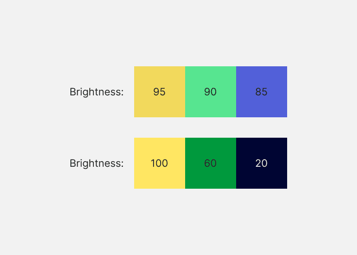
When colours have different brightness values, this helps them look and feel distinctive not just in hue, but in brightness. This leads to better colour palettes because colours don’t compete with each other as much.
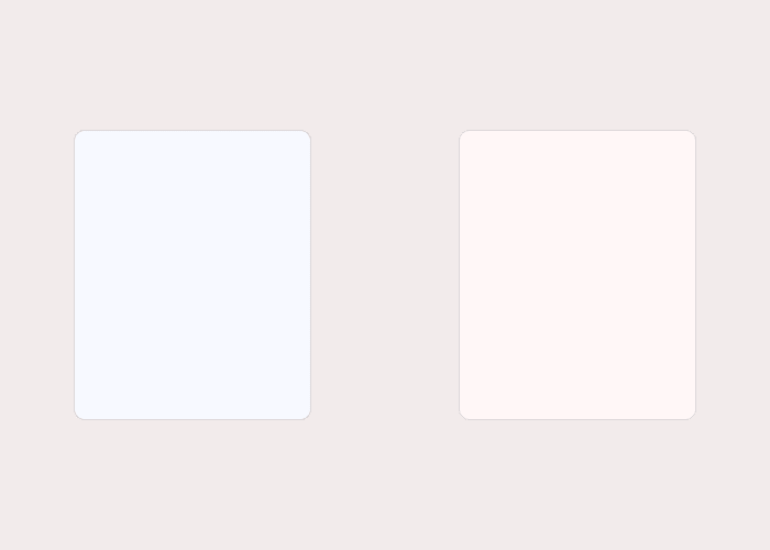
If you use both warm and cool colours to saturate neutrals, the colour palette will not feel coherent.
In the example below the left side uses a warm background and a cool foreground. The right side uses a warm background and foreground.
The spacing you use between elements, and the size of elements, should be determined by some kind of scale. This will help the design to look coherent. In the example below, every element uses multiples of 8. Horizontal and vertical grids based on a scale help if you want to make sure elements like pictures are the right size.
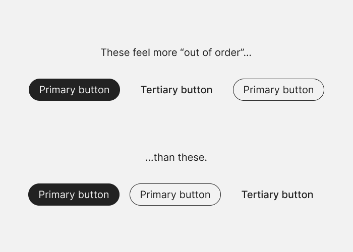
If you have a series of elements in a row or column, and some are more visually heavy than others (two buttons and three links, for example), you should arrange them like a triangle. The visually heaviest element should go first, and the least heavy element last, in order. One caveat is that the visually heaviest element should be on the outside edge. If your elements are against the right edge of the design, for example, the heaviest element should be against the right edge. Elements that go in size or weight order look more satisfying.
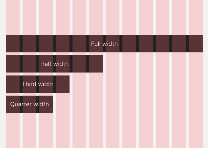
If you’re going to break your design up into vertical columns, use 12 columns. A 12 column grid can be broken up into 1 column, 2 columns, 3 columns, and 4 columns, so it gives you a lot of flexibility.
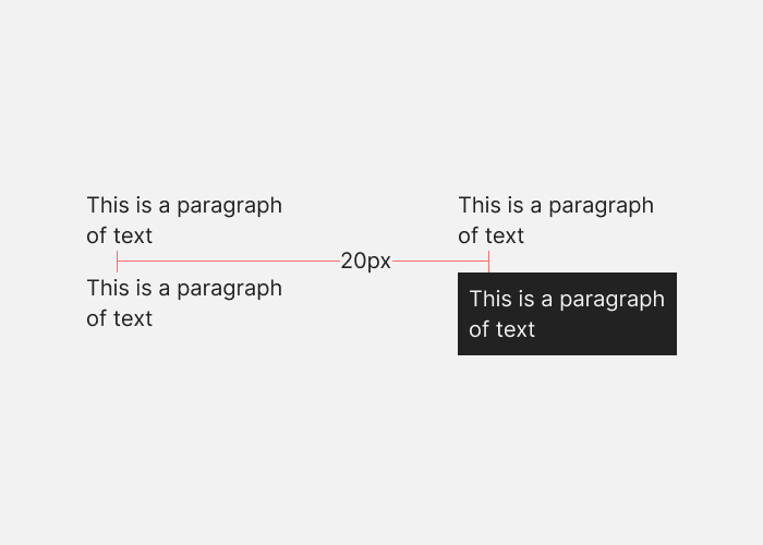
When you’re measuring out space between elements in a design—for example if you want 100px of vertical space between blocks of content on a landing page—the spacing should be from one point of high contrast to the next. This is because our eyes find the edges of elements based on contrast, so we expect the spacing to run between points of contrast.
A white background with black paragraphs of text means that the points of contrast will be the end of one paragraph and the start of the next. But if you put a black background behind one white paragraph, the spacing should run from the end of one paragraph to the start of the black background, then again from the start of the black background to the start of the paragraph.
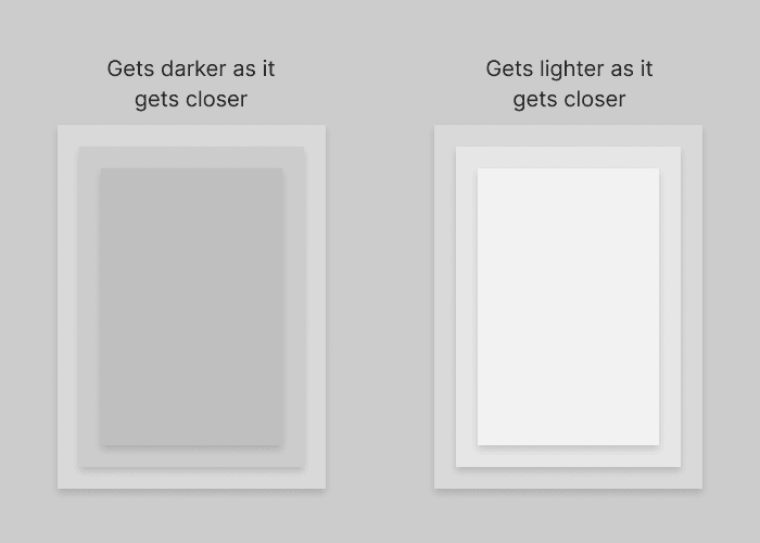
As elements on the screen get closer to the user, they should get lighter. This applies to both light and dark mode UIs, because it matches how the real world works.
In the example below, the left side is incorrect and the right side is correct.
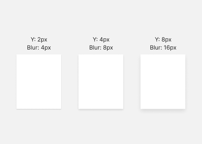
e.g. If you create a shadow which extends 4 pixels on the Y axis, use a blur value of 8 pixels. As the element gets “closer” to the viewer, it’s a good idea to also lower the opacity of the shadow. This looks good because as elements move closer to the light source, their shadows get more blurry.
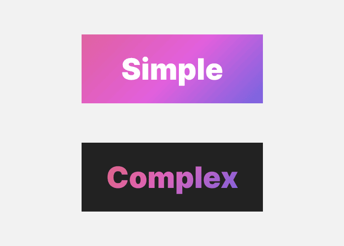
A complex background (e.g. a colourful gradient fill) works best if the foreground (e.g. text) is simple. And a complex foreground element is best on a simple background. You can put simple on simple, but it tends to look plain. Complex on complex should be avoided because it’s hard to pull off and will add visual clutter.
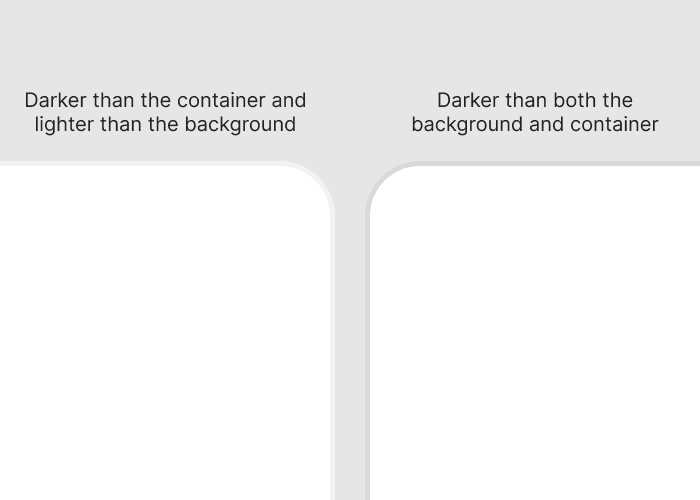
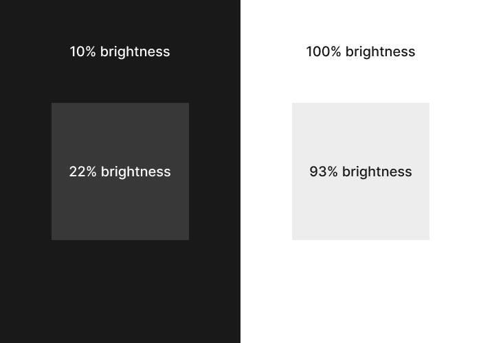
The brightness difference between background and container should be within 12% for dark interfaces, and 7% for light interfaces. These percentages refer to the brightness value in the HSB colour system.
This is based on a study of about 100 well-designed websites where I checked the brightness of containers against the backgrounds.
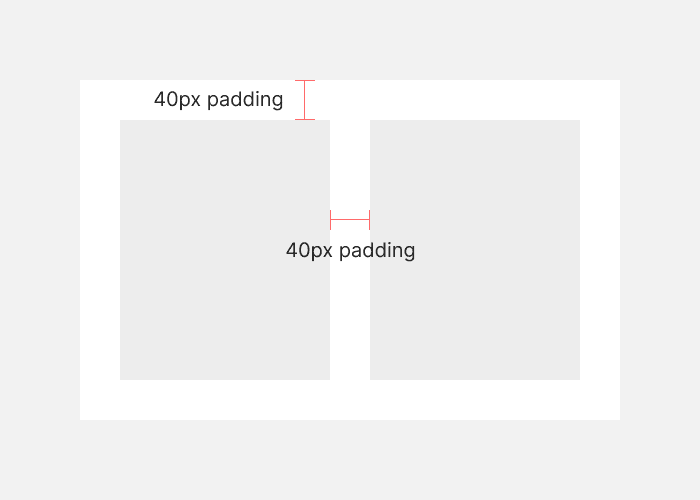
In containers, inner padding is the space between elements inside the container. Outer padding is the space between the elements and the edges of the container. This outer padding should be the same or more than the inner padding. Elements that are more related should be closer together. The elements inside a container are more related to each other than they are to the container itself.
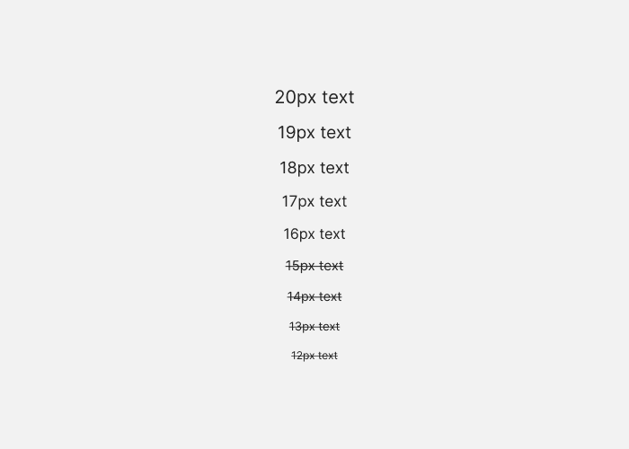
16px is the default text size in most browsers. Text below this size gets harder to read, so it’s safest to avoid it for body text. The higher you go beyond 16px, the easier the text is to read.
If you are writing code yourself, use whatever equivalent of pixels you prefer.
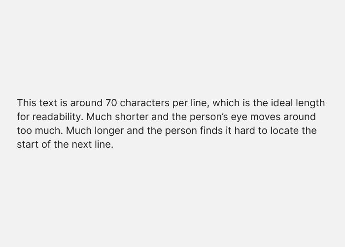
It doesn’t matter too much if your line length is 60 or 80 characters, but go too far either side of that and you might run into subtle readability issues.
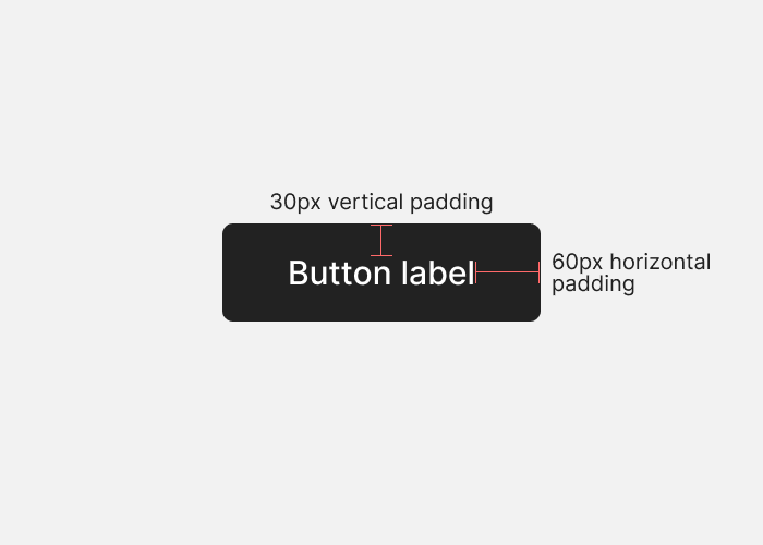
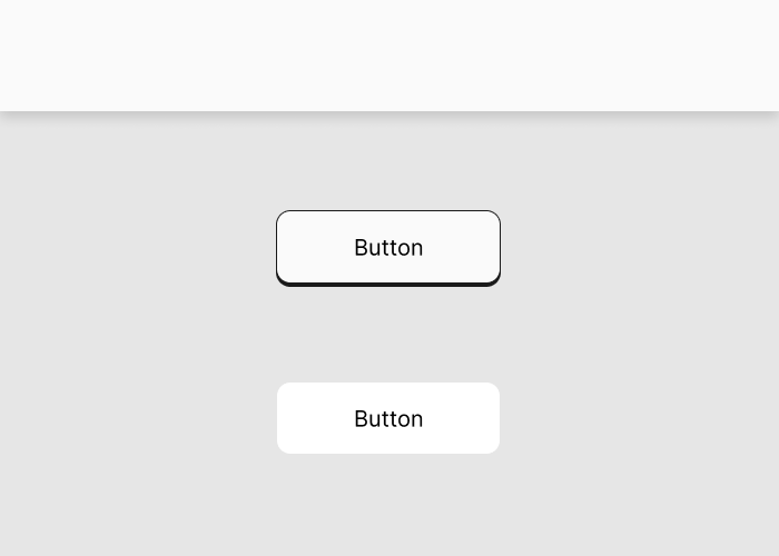
The standard button pattern is wider than it is tall. If you want people to recognise an element as a button, it’s a good idea to follow the pattern. In the example below, the padding above and below the label is 30px, and the padding to the left and right is 60px.
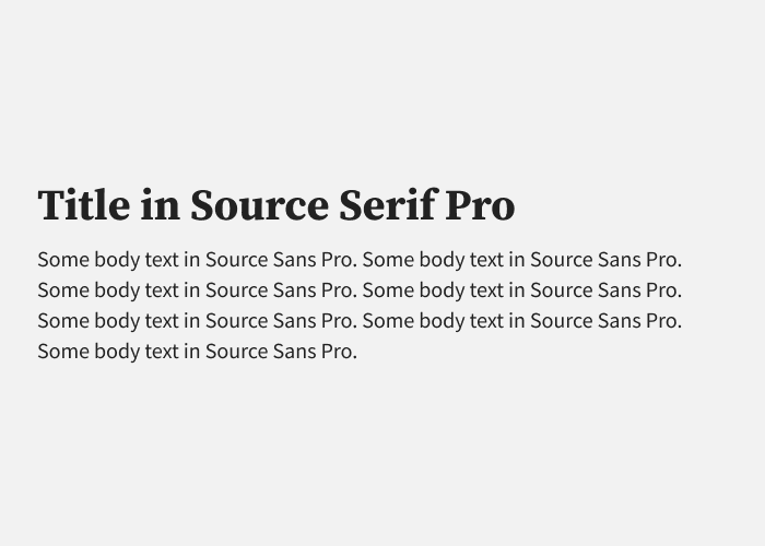
A second typeface is an opportunity to reinforce the concept behind a design. It also helps add some variety to a design. It’s rarely necessary to use more than two, and it might make the design feel visually confused.
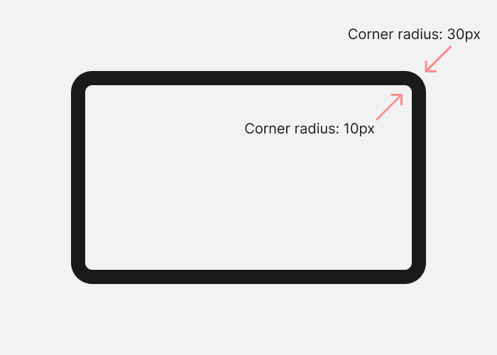
Sometimes you will have two or more rounded corners nested together. If you want them to look right, set the inside corner radius to the outside corner radius, minus the distance between the two. In the example below the outside radius is 30px, and there is a 20px gap, so the inside corner radius is 10px.
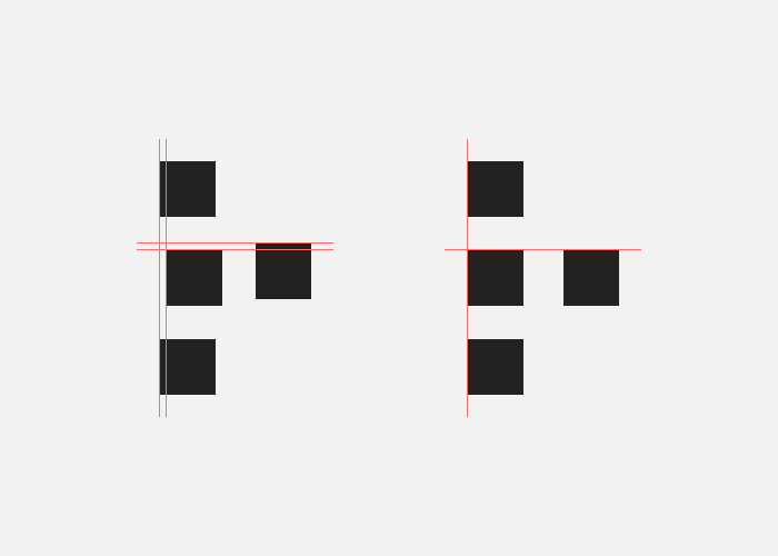
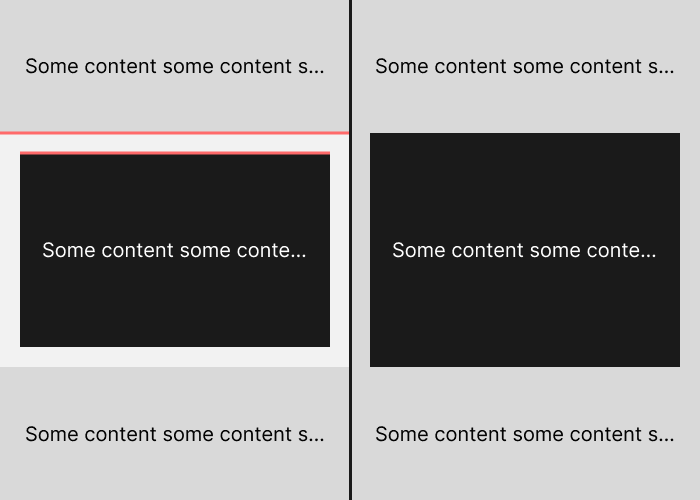
Background transitions, container edges, and dividing lines will create hard visual divides. You should not have two or more hard divides next to each other. You can see this marked in red in the example below. More than one hard divide creates visual clutter and catches the eye. In the example I have removed the background transition so that the hard divide only comes from the container edge.
It’s hard to make shadows work in a dark interface. Either your background colour needs to be light enough to show a shadow, or the shadow needs to be hard enough that it’ll stand out. Which is more attention than a shadow probably needs. It also doesn’t make much sense for shadows to be visible in a dark place.
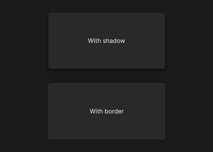
Stick it one depth technique throughout an interface. If you’ve got a soft shadow on your main navigation bar, use soft shadows elsewhere. Don’t suddenly switch to a hard/abstract shadow, or no shadow at all. Any of these approaches are fine, but if you mix them it looks inconsistent and unprofessional.
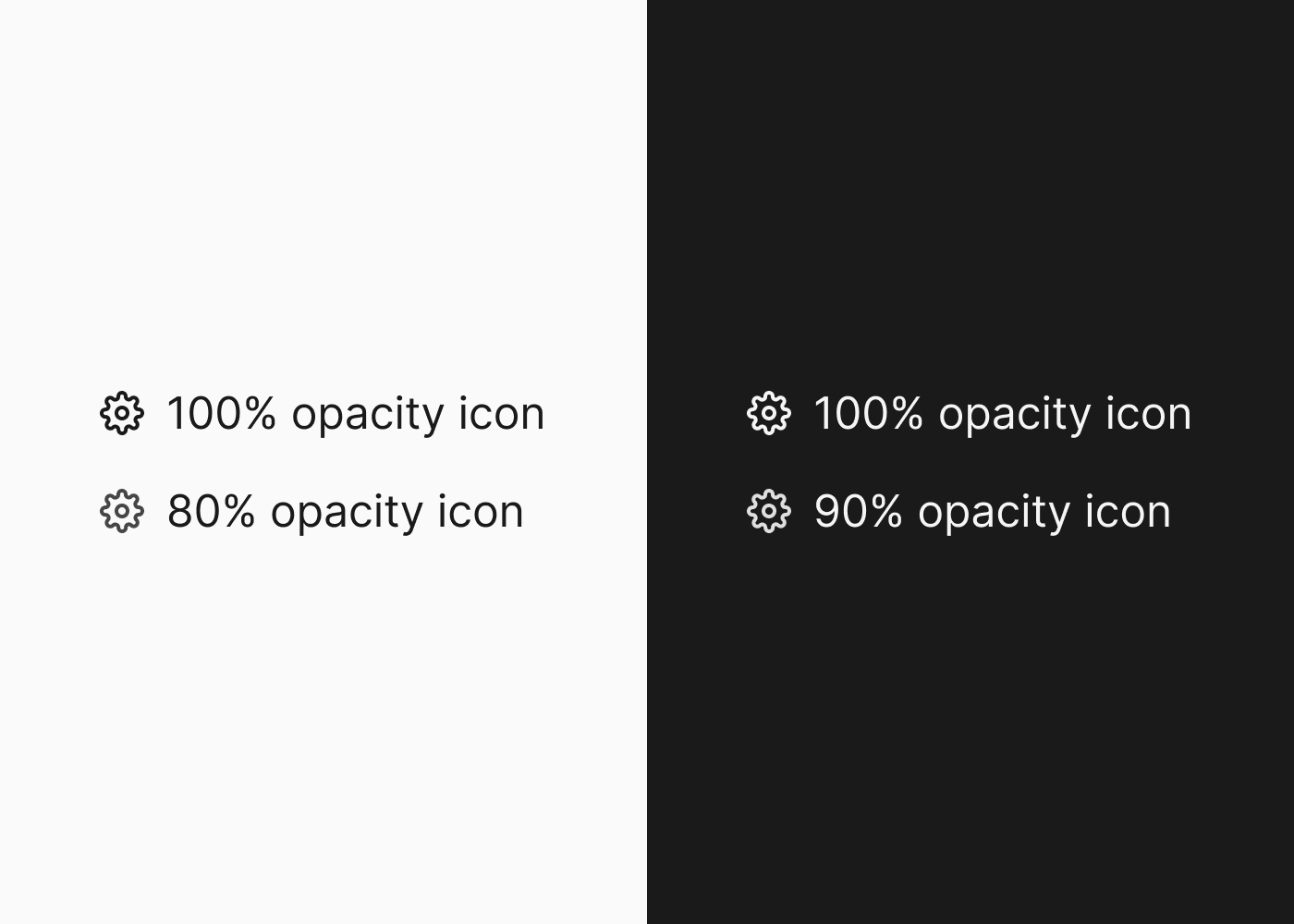
An icon will often look visually heavier than any text it’s paired with. Lower the background contrast of icons paired with text. In the example below I’ve done this with opacity, but you can make the icon colour lighter/darker as well.