Collections feature
I designed this collaboration feature. It raised engagement with a key collaboration feature by 1,500%.
Background
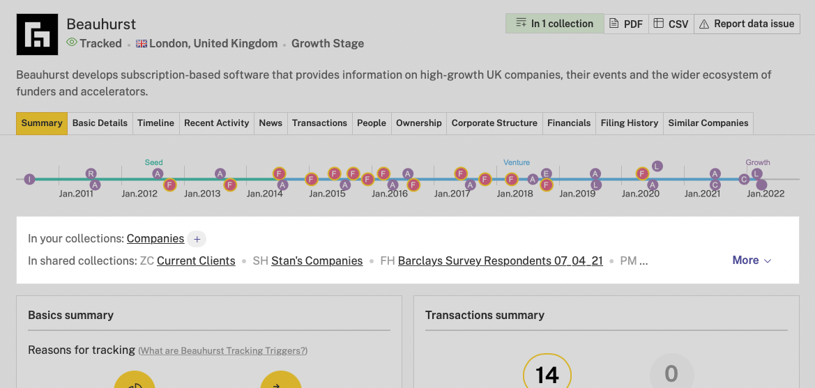
Beauhurst is IMDB for UK companies. We have profiles on companies, the people at them, investments into them, and more. Our subscribers can save these profiles to lists that we call “collections”.
I worked with a product manager and developer. We were asked to improve engagement with collections.
Metrics showed that subscribers with more collections were less likely to cancel their subscription. But we didn’t know whether this was correlation or causation.
We wanted a quick win that’d increase engagement
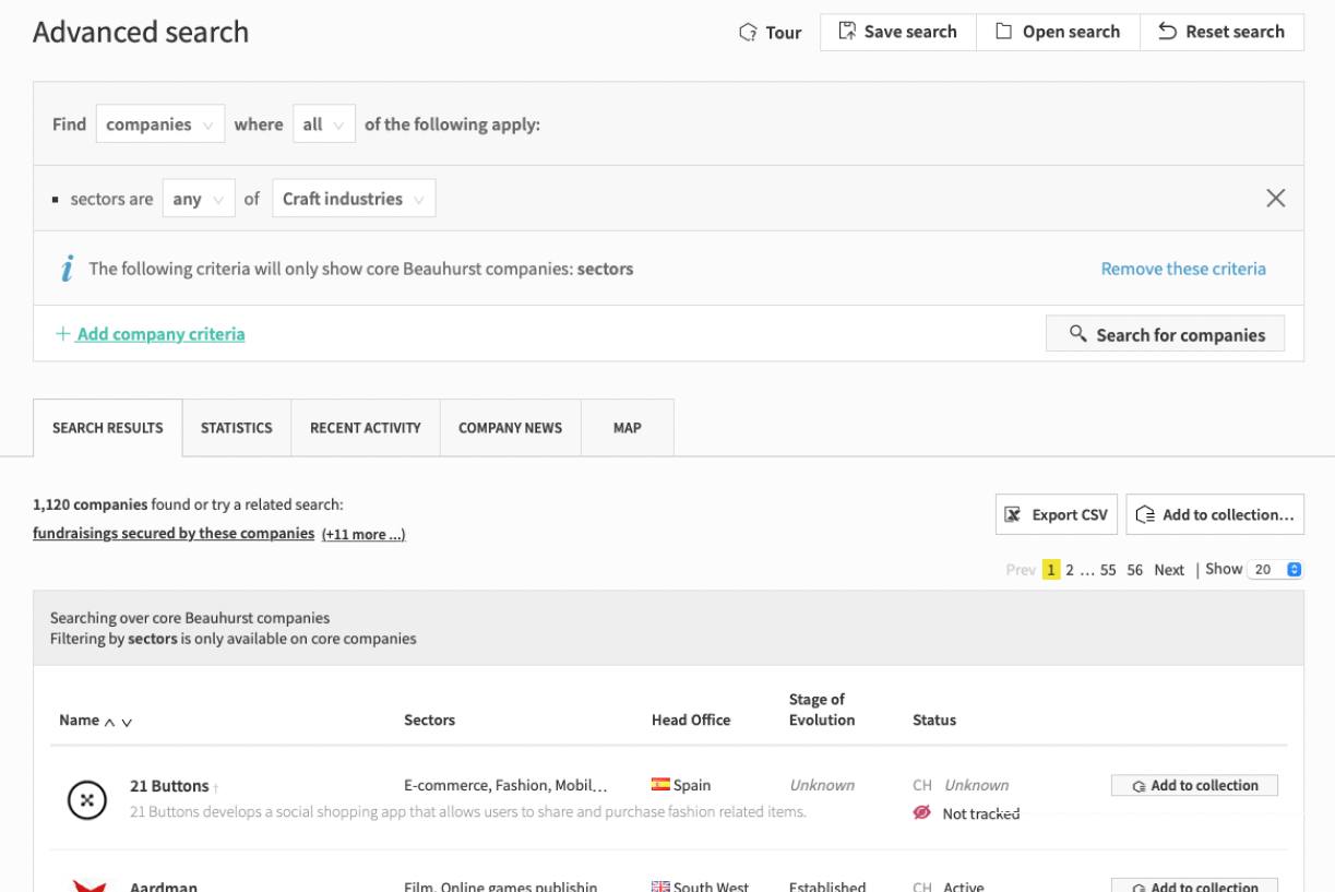
As we got stuck into bigger work, we wanted to ship something small to get the blood flowing. We focused on these two buttons above our search results table. One of them is “Add to collection”. It’s a bit quiet. If we could make it a little louder, it might increase engagement.
So I did a lot of ideation
I like to come up with a lot of options. They were all variations on the same idea: make the buttons bolder.
Even for small changes, I like to explore lots of options. This way I feel more comfortable that we choose the right direction.

We released a new button with a 50% increase
We made the buttons violet, and gave them longer labels to make it clearer what they do. Use of the button went up by 50%.
We interviewed our subscribers about collections
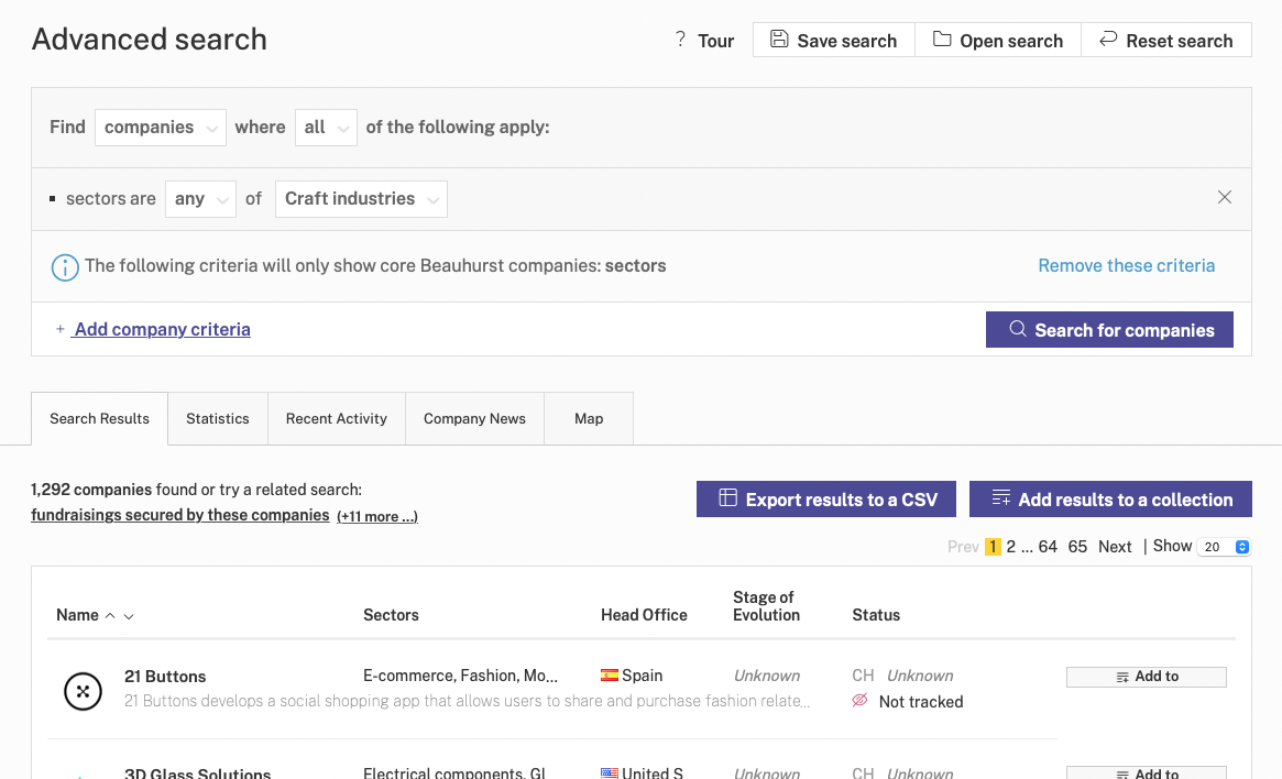
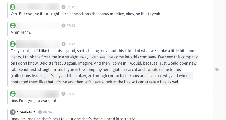
We booked in interviews with relevant subscribers and spoke to them about how they use collections.
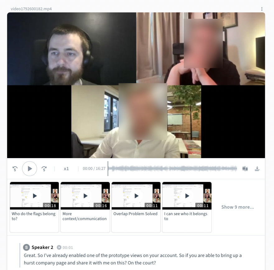
Then tagged insights in the transcripts
We used Condens for this.
We used an opportunity tree to map it all out
What I like about this method is that it gives you a visual overview of the opportunities, and helps you to choose between options.
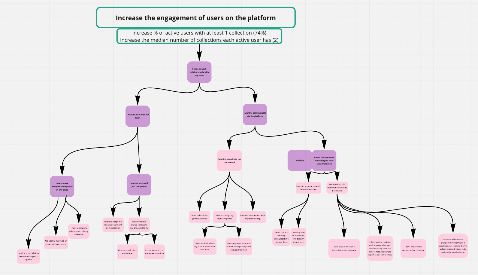
We realised our assumptions had been wrong
Before this project, lots of subscribers had asked for “collaborative collections”. We assumed this meant “more than one person can edit the same collection”. The interviews showed us that it didn’t. What people actually wanted was visibility of each others’ work in collections.
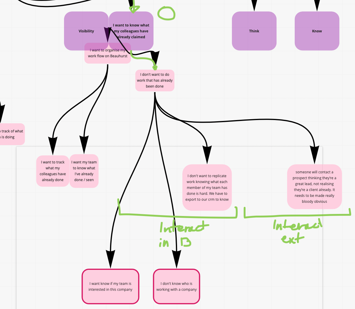
We focused on collection visibility
Collection visibility means that subscriber A can see what subscriber B has done with their collection. This helps to avoid two people working on the same company, for example.
As we chose an opportunity to focus on, I realised that I might have pushed for certain directions because I felt more comfortable with them. This is a dangerous reason to choose a direction. Maybe it’s not the most valuable? Maybe the “uncomfortable” projects are just as feasible, once you get stuck in?
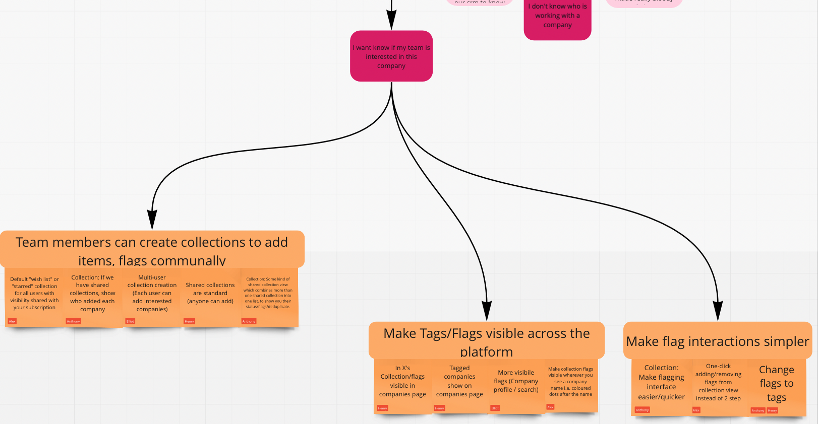
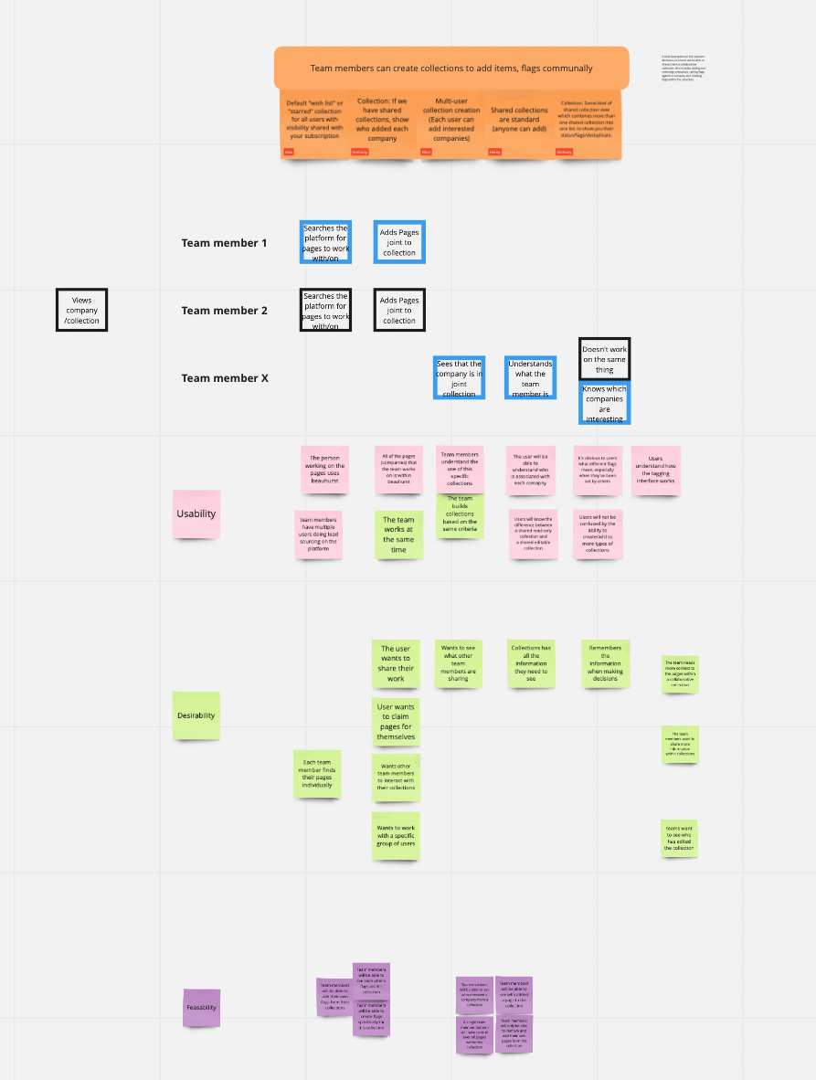
We workshopped solution ideas as a team
These ideas ended up centring around our tagging feature. Items in collections can have tags assigned to them which help subscribers remember something about them. This works like tagging does in any CRM.
We also listed assumptions we’d need to test
These tests would help us prove or disprove the important assumptions attached to a certain project.
Before this exercise I had not realised how hard good assumption testing was. The easiest assumption test is “let’s build it and find out if it works”, which isn’t sustainable.
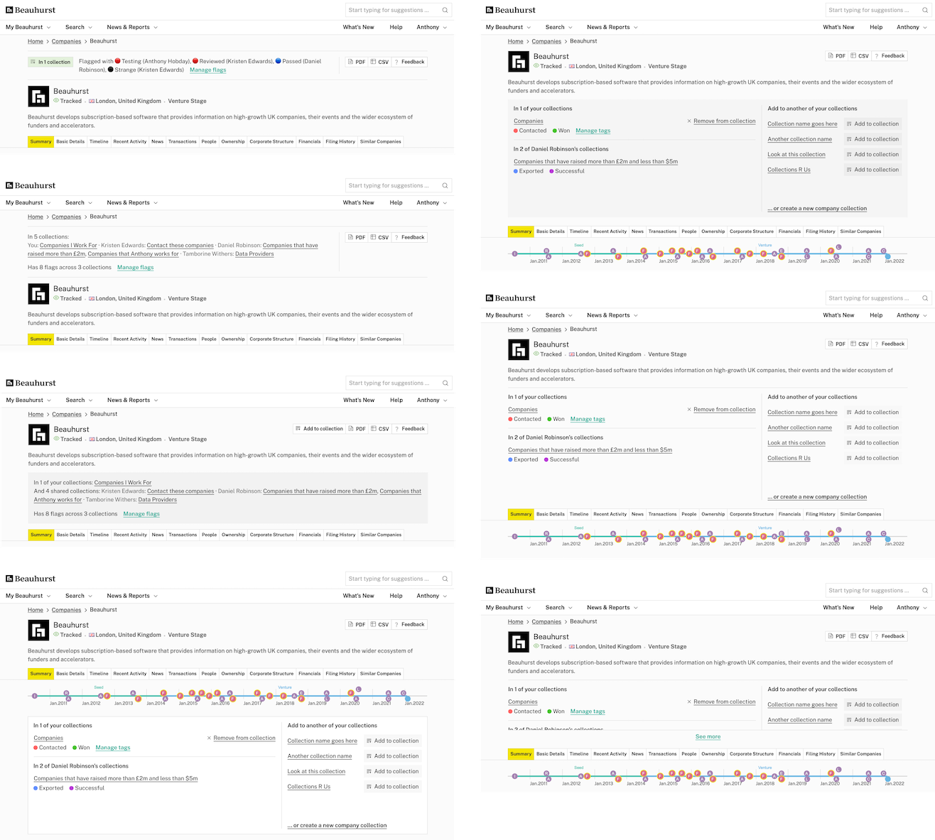
I thought of some broad solutions and iterated
I put together some mockups that represented different approaches to the opportunity in the platform. For each of these steps I discussed the options with the squad, then iterated based on feedback.

We chose a solution based on visibility
We chose a panel that’d be shown near the top of the company profile page. This helps visibility of the tags, but also takes up valuable vertical space. A tricky balance.
I made some prototypes in Figma
Once we’d settled on a general direction, I built prototypes so we could test them with our subscribers.
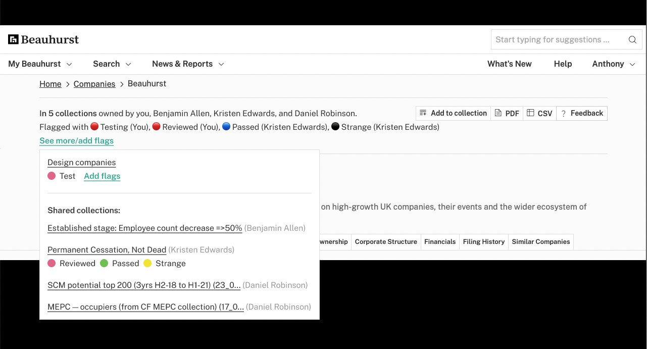
I iterated on the clear winner
Results from subscribers and feedback from people at the company helped to choose the specific direction.
I handed it off at the last minute
At this moment we started another product squad to work on central feature of the platform, and I was needed elsewhere. I handed this project off to another designer, and gave them my notes from the most recent round of feedback.
The “polishing” phase is one of my favourites, so it was a shame to hand off the project just before the finishing touches.

Tag use went up by 1,500%
Metrics have shown that collection engagement is up. For example, since release the number of tags added to companies has gone up 1,500%. The number of new tags created has increased by 423%. Our account management team has passed on positive feedback from our subscribers.