An app to fight climate change
A quick note: This case study is intentionally brief so it’s easy to scan. I’m happy to go into more detail about any of these steps.
Can knowledge change people’s behaviour?
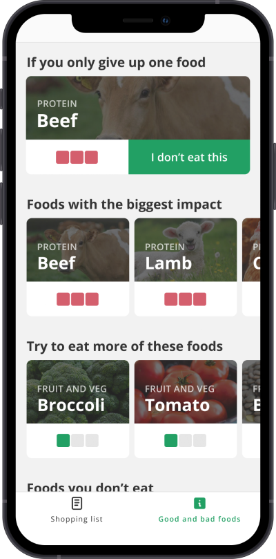
When I learned that beef and lamb were far and away the worst climate change offenders, I gave them up. Can design help other people be more aware?
Also, I wanted to practice mobile app design. Can you say, “pre-conceived notion”?
I interviewed people about their food-buying habits
I covered topics like shopping habits, food-buying concerns, and knowledge of climate change.
Every person I spoke to underestimated food’s impact on climate change, which validates the idea that ignorance is an issue.
Affinity mapping outlined two types of people
I found that most people go to the shop with a list. The rest order everything online. Most of the people who use a list use their phone, which suggests there’s room for a mobile app.
I thought about where an app could have impact
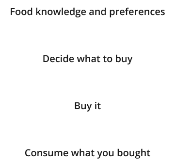
I considered the food-buying journey. I didn’t want to shame people who had already bought “bad” foods. I wanted my app to convince people to buy different foods in the first place.
And settled on a fancy shopping list
I wrote down all sorts of ideas but settled on a shopping list app because it was a clear theme in my research.
Here’s how I’d test my value assumptions
I didn’t test whether my app was likely to succeed, but here’s how I could have:
- Build a simple web app that lets people write out a shopping list on their phone. This is easier to build and test than a mobile app.
- Concierge test: ask people to send me their shopping lists. I send them back information about the foods they want to buy.
Inspired by the research, I listed possible features
I pulled out these features from my list of ideas:
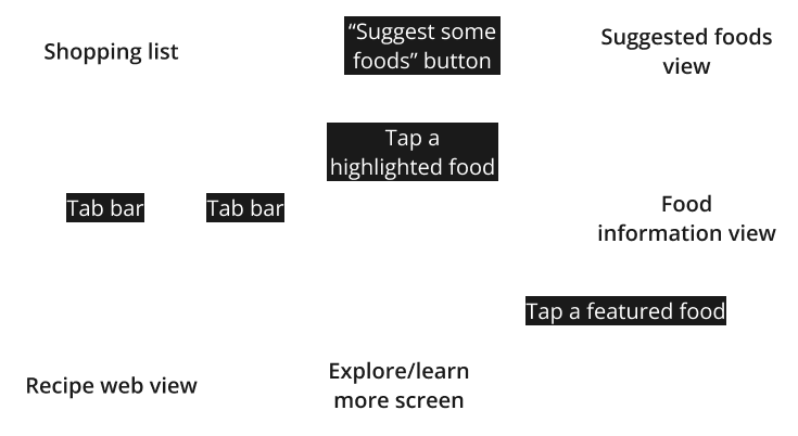
- A shopping list that scolds you
- Planet-healthy suggestions for your list
- Proactive information if you want to learn what to avoid
- A web recipe browser that’ll highlight problem foods
I cut one features for feasibility issues
I looked into web views on the iPhone for the recipe browser. It turns out Apple doesn’t allow much in the way of “highlight problem keywords as the user browses the web”. So that feature was thrown out.
I created block-based wireframes to check layout
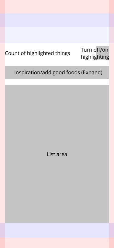
I like to block out mobile screens with grey boxes first.
Then bumped up the fidelity for usability testing
I needed just enough visual design so that people wouldn’t be distracted.
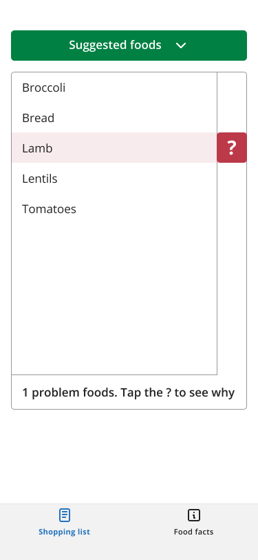
I iterated based on feedback from the usability testing
Usability testing found lots of issues. For example I showed a given food’s climate impact in “KG C02e”. It’s a standard measurement, but most people aren’t aware of it.
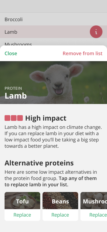
I moved on to final mockups
Mockups are fun. And time consuming. Figma components helped save a lot of that time. Here’s an example screen.
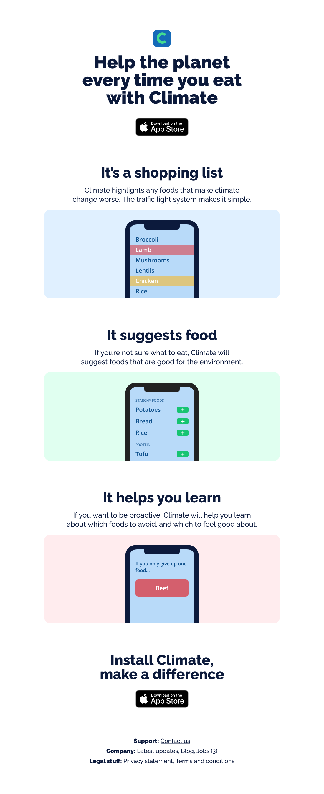
I designed landing pages for visual design practice
I designed three landing pages. Here’s one of them.
I didn’t build the app
I don’t have the development skills to build an app. Hopefully one day a billionaire sees this case study and wants to fund the development.