The website design hall of fame
Here are the websites that I think have had the biggest impact on website design.
Apple
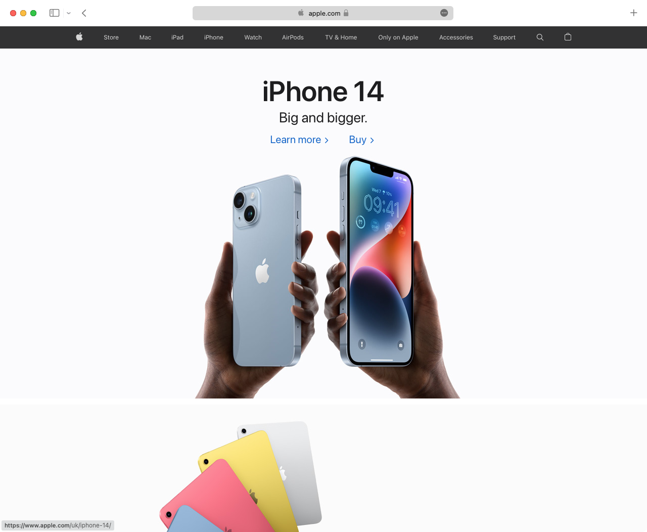
Apple is well known for trendsetting in hardware, but they do the same in web design. Those who can spare the effort like to copy Apple’s cinematic scroll-triggered animations. Their “bento box” masonry style container layouts have appeared on many notable websites.
Craigslist
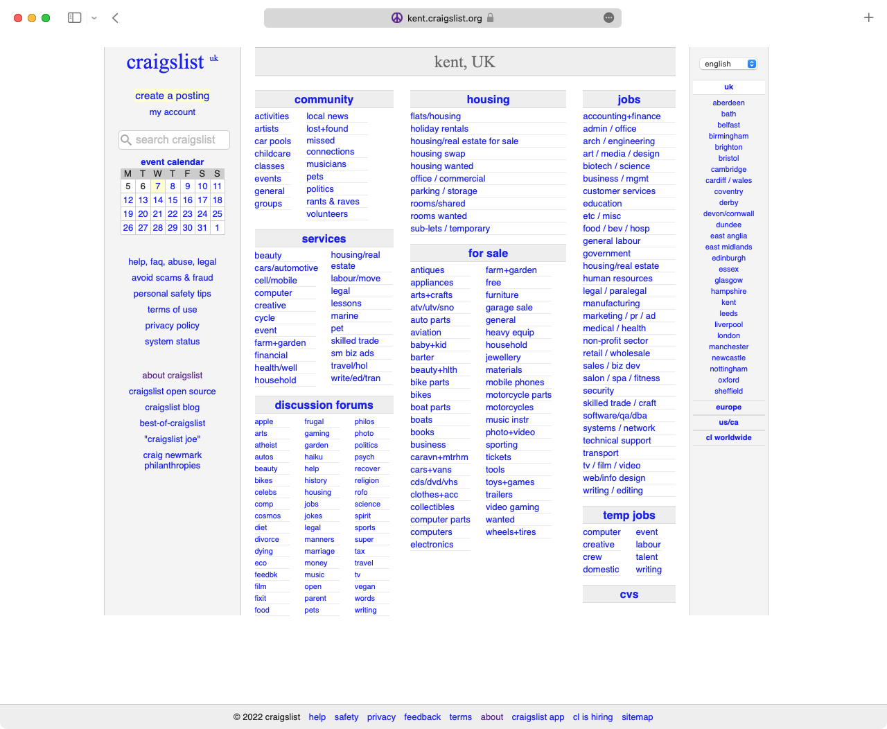
Craigslist has represented the “default style” of the web for decades. They’re the first counterpoint whenever someone claims that a website needs modern style to succeed. An inspirational—if extreme—example of “function over form”.
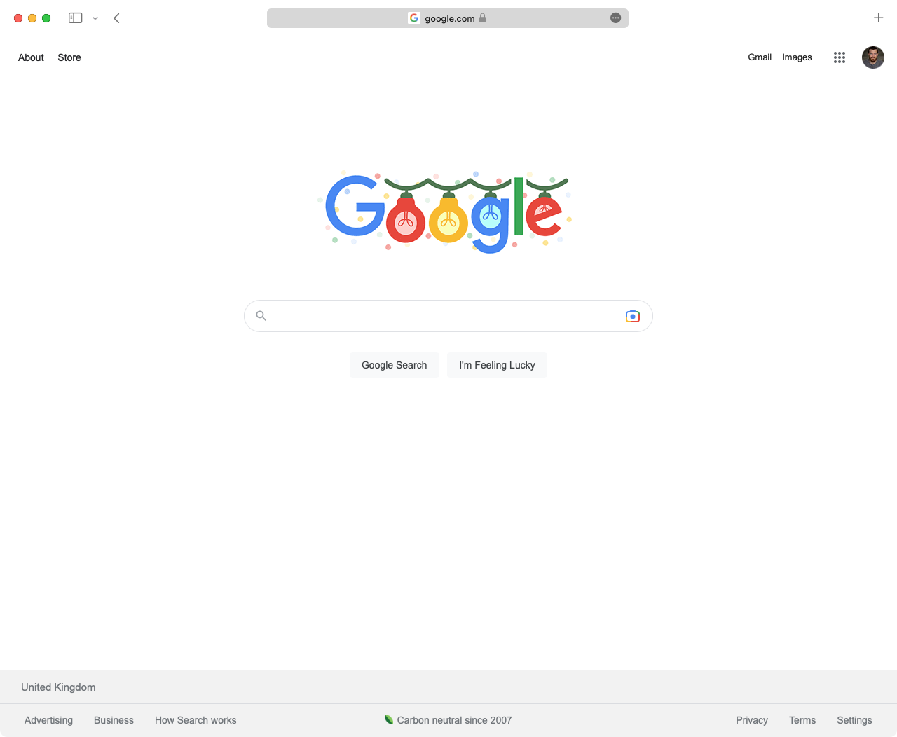
Google’s home page is the most-mentioned example of minimalism on the web. Looking back, it feels like their nothing-but-a-search-box—a strong contrast to some of their competitors—was an overnight success. While the four corners of their home page have suffered some entropy over the years, it’s still a good example of commitment to an ideal.
GOV.UK
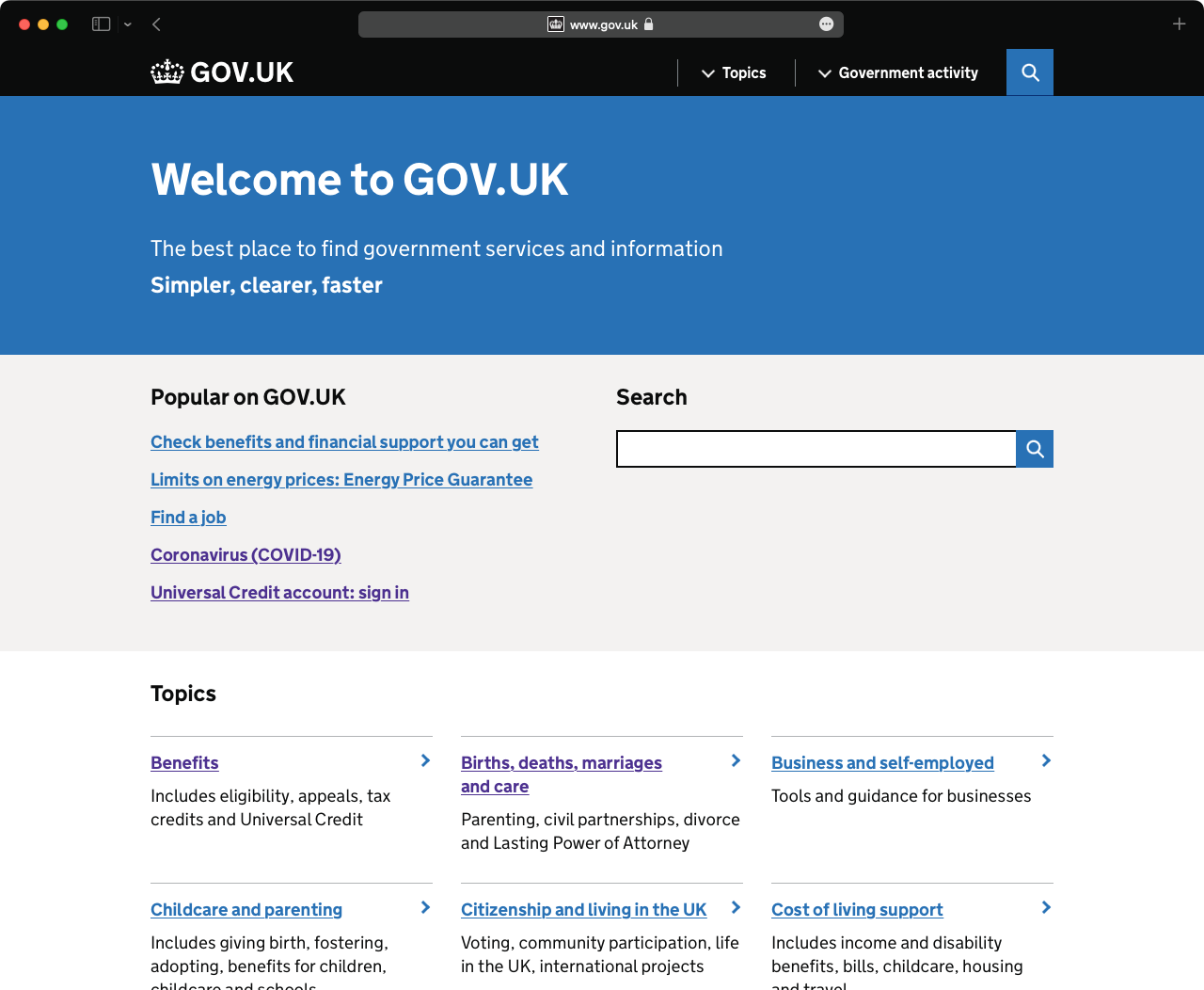
The UK’s Government Digital Services is stubbornly committed to design. Instead of beauty, they focus on usability. Their tireless research and iteration on vital services sets the gold standard for governments around the world.
Linear
I’d argue Linear has had the most impact on SaaS website style trends after Stripe. Their commitment to quality and details is impressive, and they stand apart with a rebellious approach to style.

Stripe
Through many iterations, Stripe is often held up as the best example of good visual design on the web. The company’s commitment to quality shows. They grab attention with centrepieces like the gradient and the globe. They wow those in the know with attention to detail.
