A critique of the Stripe website
If you asked 100 designers to think of a website with good visual design, “Stripe” would cross many of their minds.
So what is it about stripe.com that lands it in the visual design hall of fame?
Goals
I’ve never worked at Stripe, so I need to make some assumptions. Here’s what stripe.com is designed to achieve:
- Stand out to individual visitors
- Stand out to organisations
- Attract talent
- Provide clear information
I’ll spend the least time on “provide clear information”. It’s a common goal, and uses common visual design techniques.
Goal 1: Stand out to individual visitors
World-class visual design is a way to stand out. Especially when your audience is developers. They classically don’t get targeted with a lot of good visual design.
Stripe’s achievements so far are characterized by a lack of fear — starting with the guts to tackle a space with a high bar for success, massive incumbents, and an unsexy reputation.
Good visual design appeals on a personal level, with practical results. If a developer needs a payments platform, it’s hard to ignore the one that looks the best. Good visual design can be enough to convince a visitor that they don’t need to look at any more options.
Together we design and build stripe.com and other sites that amount to what is, for many, their first impression of Stripe. We want to make every pixel count, we want it to be enthralling…
Goal 2: Stand out to organisations
If Stripe has a reputation for good visual design, this appeals at an organisational level as well. It’s generally the organisation that decides which payments technology to adopt. Stripe’s visual design is so impressive that other impressive companies will want to be seen to use them. If other world-class organisations adopt Stripe, this is valuable social proof.
Stripe’s main audience is other people who build products; on their behalf we agonize over the details.
Goal 3: Attract talent
It’s hard to make a good product without good employees. A simple—but not easy—way to hire the best talent is to be an attractive company to work for.
Stripe’s relentless attention to craft has become their Field of Dreams. Build the most compelling version of a thing, and passionate people will show up. But it takes a lot of trust, time, and investment to build in that way. When done right, it can lead to a huge long-term advantage. Stripe’s quality-driven approach has had obvious implications for recruiting, given Stripe’s reputation with designers and developers.
Designers will want to work at a company if it spends an unnecessary amount of time on design. This is because designers love to spend an unnecessary amount of time on design.
From early on, Stripe was known for beautiful landing pages and insidery easter eggs, and, as a result, developed something of a cult following amongst designers. Designers at Stripe have always pushed for the time to noodle on something until it’s not just good, not just great, but exceptional. They take their work all the way to the outer edges of what's possible or reasonable
If you want to attract the best designers, show them that they’ll be given space to sweat the details. This is not easy at all, which is why this isn’t more common. It takes hard work, and every person at the company needs to be on board.
Design has had an impact at Stripe because it is valued, nurtured from the top… Success takes being intentional about how design works within the company at every stage of growth.
Stripe’s approach to visual design
If I have to summarise Stripe’s approach to visual design, it’s this:
Simple design, a few centrepieces, and impressive details.
“Simple design” is how Stripe tackles the goal to provide clear information. Text is usually the most important content on any website, and it benefits from a simple approach. If you try to be clever with text, you often get an unreadable mess.
Centrepieces
Some visual design elements are there to be noticed. The splash of colour at the top of Stripe’s website fits the concept perfectly.
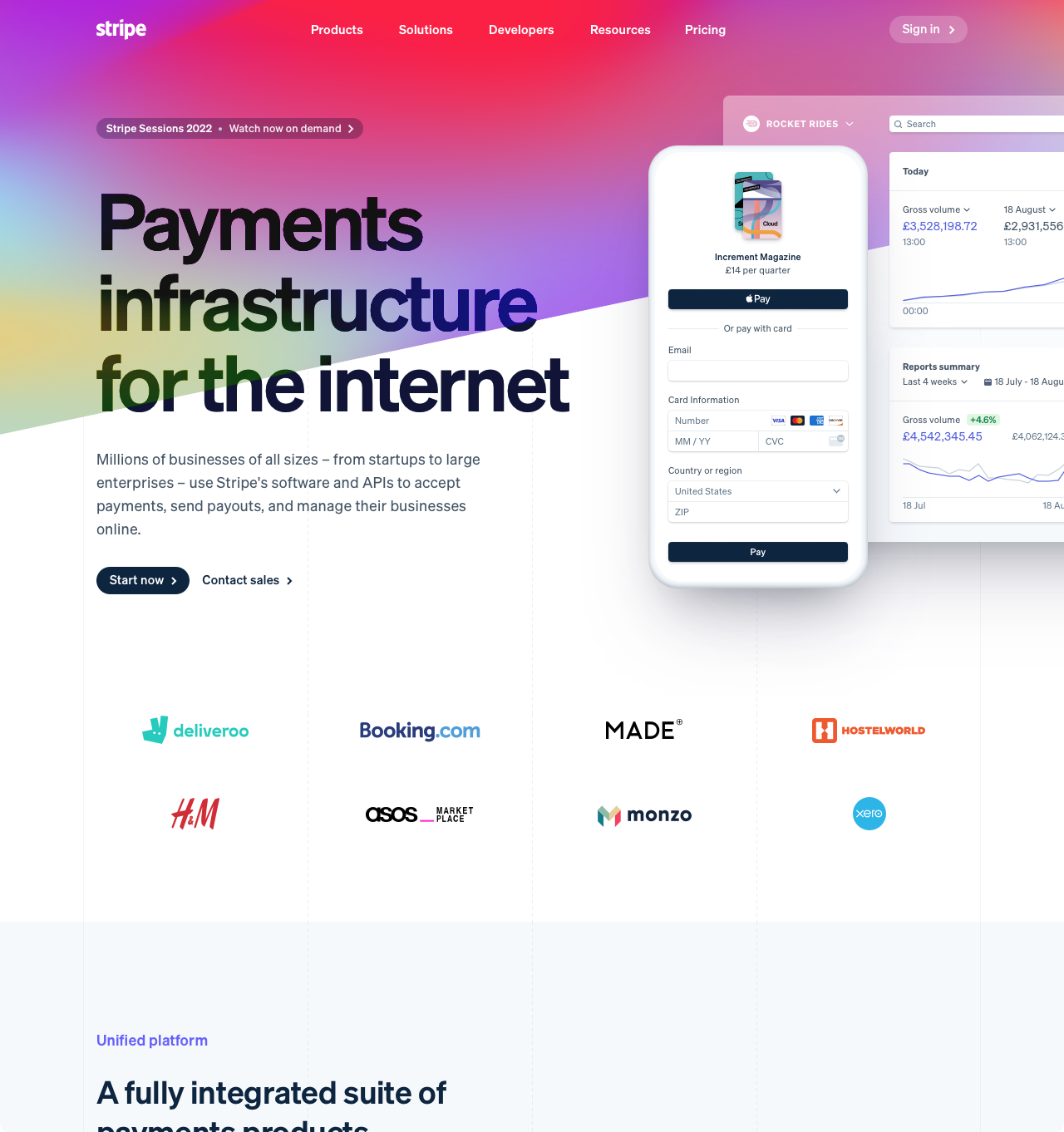
This diagonal section of colour serves a few purposes:
- It grabs your attention when you arrive.
- It sets up a diagonal motif that Stripe uses throughout the website.
- It prompts you to think that Stripe is bold, and exciting.
You can’t see it in a screenshot, but the colours slowly move around, which is mesmerising.
The fact that the diagonal slash cuts across the headline is an interesting choice. Generally designers will avoid something that might hurt the readability of text in this way. Since the headline is so large, it’s not a big impact, and it subtly communicates that Stripe is rebellious. I don’t know if they really are, but it’s probably a useful image for a startup that’s challenging existing large finance companies.
Incidentally, this diagonal colour section was already present in Stripe’s previous website. But it transitioned to the next section in a more “sensible” place, which loses some of the charm:
The other centrepiece on the home page is this globe:
At first glance you might wonder why it’s a centrepiece. It’s a background element, and aside from the animated line it doesn’t stand out much. But while the colour splash at the top is a visual centrepiece, the globe is a technical one. It appeals to quality-obsessed developers as much as designers.
For the new stripe.com, we built a 1:40 million-scale, interactive 3D model of the earth…
We set out to build a globe that inspires a sense of awe, invites people to explore, and conceals details for discovery…
Stripe wrote a whole blog post about this globe, so I’m going to use it to illustrate some points.
The globe is a classic example of “we didn’t have to do this, but it’s cool that we did”. The company was ready to launch the website without it. But then (as far as I can tell) they delayed the launch to make sure they were happy:
For our landing page, the goal of the globe was to capture our global scale and bring a visual metaphor to life. A week before launch, we had a nice animated map where the globe now sits but we didn’t love it. Despite the impending release, an executive … posed to us: what would you build if you had the time to do it the way you wish you could?
This is a perfect example of “spend an unnecessary amount of time”. They already had a solution, but they weren’t 100% happy with it. So they spent a lot more time and effort to be happy about it.
When they realised the globe didn’t perform well on slower computers, what did they do? That’s right, they spent more time to make sure it performed well on slower computers. Everyone was going to see that globe, no matter what it took.
A few days prior to launch, we tested the page on laptops without dedicated GPUs and reported that they were struggling to power a 5K display with the globe running fullscreen. We weren’t willing to accept defeat by falling back to an image for this rare case.
Impressive details
Design isn’t all about big, splashy, impressive elements. Those things help, and Stripe makes good use of them. But what designers love to focus on is the small details. The tiny elements that take a design from 80% to 100%.
These small details make an important difference to a website’s sense of quality, but it’s not an easily-noticed one. This lack of obvious value means that many companies ignore the benefit of attention to detail.
In terms of attracting the best talent, it is the small details that good designers pay attention to. It is a company which clearly spends time on small details that those designers want to work for.
“Way back in the day Stripe was known for making amazing websites and products and people would ask ‘how do you do it?’ We would say we simply spend 20x more time on this than what anyone else would. And refuse to cut corners along the way. Designers aren’t usually given that playing field or power to do that.”
Here’s an example of a small detail:
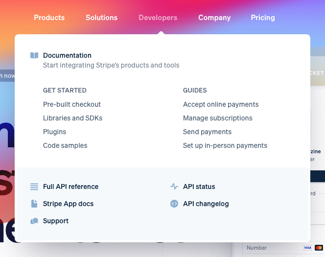
This menu appears when the user hovers over part of the main navigation. At the bottom of the menu there’s a grey area, which represents a lower priority than the white area above it.
Most designers (myself included) would simply add a divider between the white and grey backgrounds. But Stripe decided to inset the grey background. Now the white background of the menu continues around the grey area and acts as a border:
This is not hard, nor does it change how the menu is viewed or used. But it’s more fiddly, and most designers wouldn’t think to do it. This is a sign to designers that Stripe cares about the details.
Perhaps my favourite detail on Stripe’s website is the visible structure.
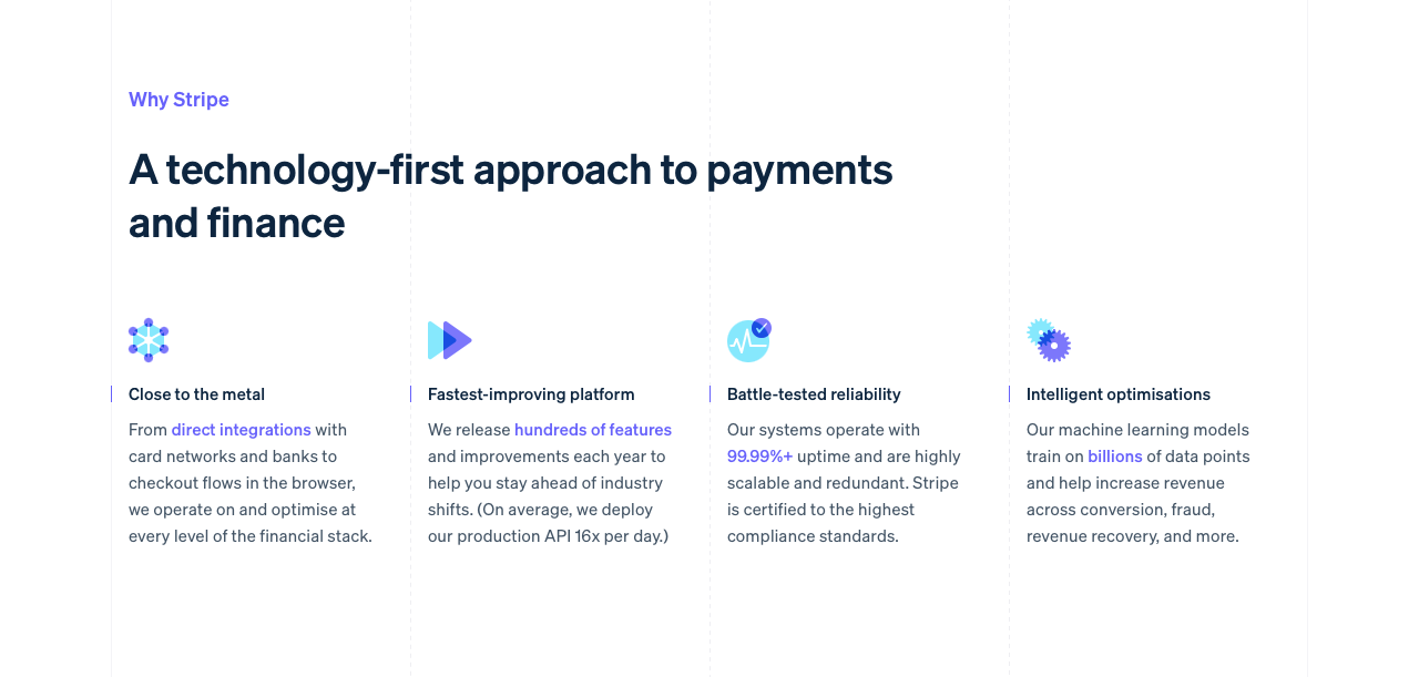
Stripe uses a four-column grid throughout the website. While most grids are implicit, Stripe made theirs subtly explicit. They used faint grey lines to pick out the outside edges of each grid column. Solid lines for the outside edges of the layout. Dashed lines for the inside gutters. These grid lines continue through the entire website, and for the most part the layout follows them closely.
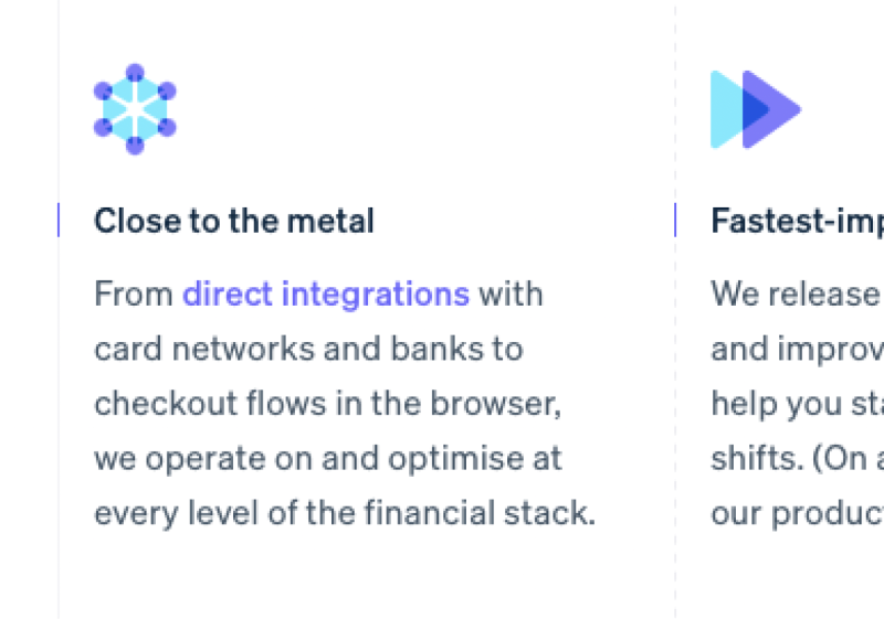
I’ve seen other websites do this. Possibly because they were inspired by Stripe. But Stripe stands out because they lean into this visible grid. For example, instead of bullet points, Stripe have picked out the grid lines in purple. You can see it to the left of “Close to the metal” in the screenshot above.
Another detail you’ll see throughout the site are these diagonal strips.
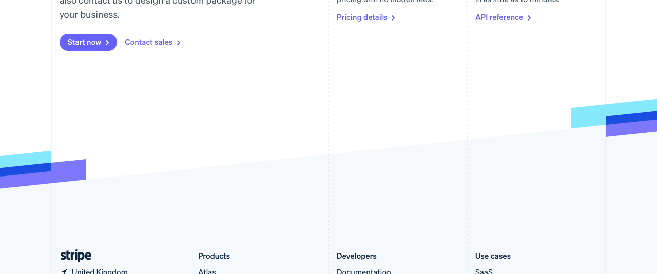
These strips accomplish a few things:
- They contrast with all of the straight lines to add visual interest.
- They continue the diagonal motif that’s established in the hero section.
- They represent the brand name (they’re stripes).
- They overlap and don’t always respect the grid lines, so they add reinforce the rebellious/playful feel established by the hero section.
I want to pick out the first point. Stripe’s visual design is generally quite simple, and this could lead to the accusation that it’s boring. Touches like this, which go against the grain, stop those accusations short. There’s just enough visual contrast and interest to keep the website engaging.
I don’t think it’s a surprise that these stripes are mostly used for background transitions. They help reinforce the transition, add the visual interest, but don’t get in the way of the content.
Conclusion
It’s not news to most designers that Stripe’s website is well designed. But I rarely see it discussed. I think that’s partly because it’s been years since it was released. Landing page design has moved on a little, and even with their centrepieces, Stripe is trending towards “normal”.
But when this website launched, it made a splash. I have no doubt that their next iteration will do the same.