The thirteen visual design spectrums
Any given visual design sits on each of these spectrums. For every spectrum, either end is valid. There aren’t any “bad to good” spectrums like “unreadable to readable”.
Textual to graphical
An interface can be all text, all graphics, or somewhere in between. Graphics includes illustrations, icons, photos, etc.
Example: If you add icons to your button labels, the interface is more graphical.
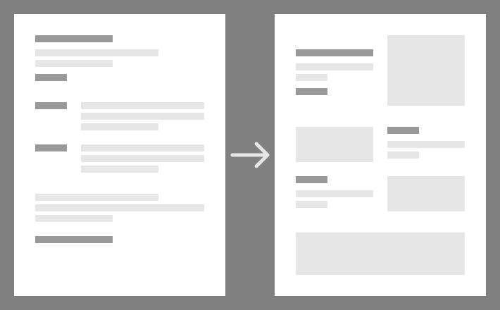
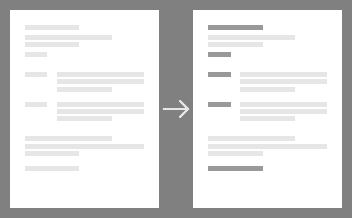
Spacious to dense
You can add more or less space between elements. You might often hear an interface described as “information dense”, but this applies to all elements in an interface.
Example: If you separate sections with dividers as well as whitespace, the interface is more dense.
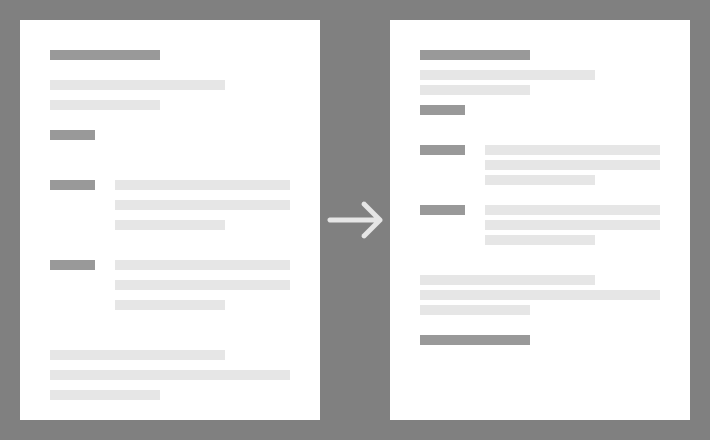
Constrained to varied
An interface can have a little variety, or a lot. This is a broad spectrum that affects all sorts of properties: e.g. colour, typeface, size, and shape.
Example: If you only use one text size the interface is constrained. If you use a large title size compared to the body text, it is more varied.
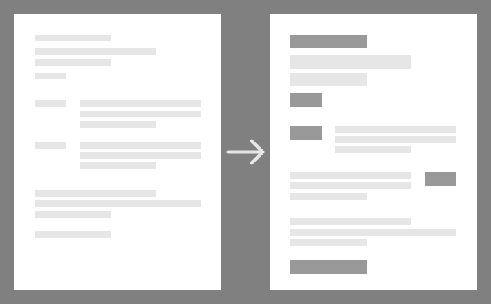
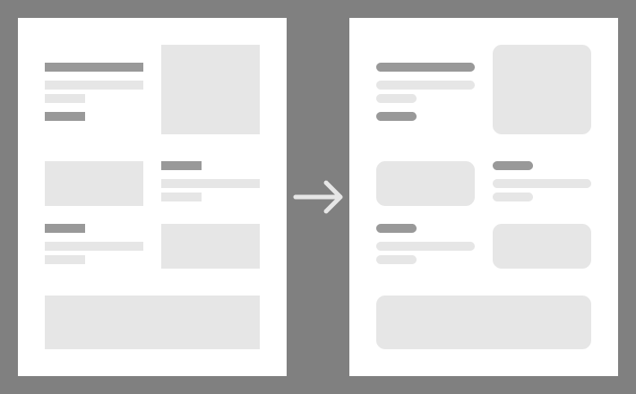
Flat to deep
An interface can have more or less apparent depth. This is often achieved with visual effects like drop-shadows. But it’s also related to how many layers your interface has, even if it’s visually flat.
Example: An interface with containers behind its content is deeper than one where the content sits directly on the background layer.
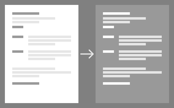
Less to more brightness contrast
The colours in an interface can vary from each other in terms of brightness by a little or by a lot.
Example: A pure black and white colour scheme has much more brightness contrast than an interface with shades of grey.
Sharp to rounded
Interfaces can appear sharp or rounded. This is related to, for example, rounded corners, shapes chosen, and typefaces.
Example: At interface with rounded corners and Comic Sans is more rounded than one with square corners and Helvetica.
Light to dark
Light and dark mode interfaces are common, but there are options between the two.
Example: A middle grey background colour is closer to dark than light.
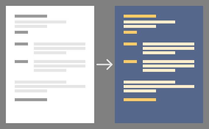
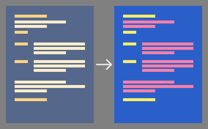
Greyscale to coloured
It’s normal to design with only black and white, but colour is more common. The more colour you add to an interface, whether it’s varied colour or not, the more coloured the interface is.
Example: A monochrome interface that only uses shades of orange is coloured.
Muted to vibrant
The colours in a design can have different amounts of saturation. Generally the more saturation in the colour palette, the more energetic the design appears.
Example: A design that uses primary colours is more vibrant than one which uses dark, professional colours.
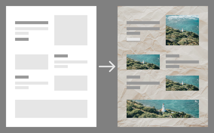
Abstract to realistic
The elements of an interface can appear to be realistic, or they can be abstract. Realistic elements might imitate physical materials, but this spectrum also covers elements like cartoon illustrations and photographs.
Example: Buttons with natural drop-shadows are usually more realistic than buttons without.
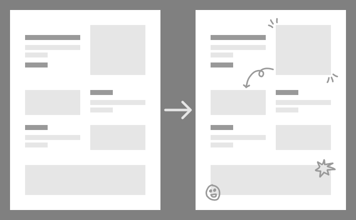
Plain to decorated
Decoration or ornament includes visually interesting flourishes that are not usually necessary to make the design work. You can have more of these decorations, or keep the design as a whole plain. Note that this also applies to elements like typography. A traditional serif typeface is more decorated than a modern sans-serif typeface.
Example: A website with abstract shapes dotted around the background is decorated.
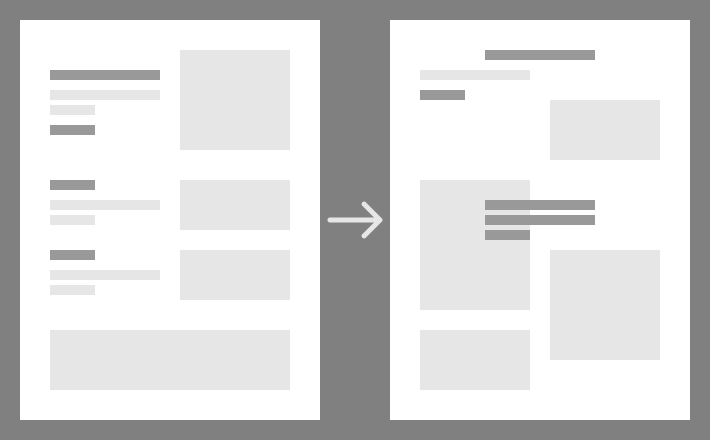
Orderly to lively
The elements in your design can all align and be ordered very neatly, which suggests the structure of the page more. Or they can dance around the page and suggest that there is no structure, although usually there is.
Example: A page where elements alternate between the left and right of the page is more lively than one where they are all left-aligned.
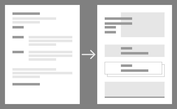
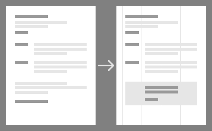
Invisibly structured to visibly structured
Most designs have a structure that elements sit within. Like a grid. The design can show this structure more, or it can hide it more.
Example: A design where each container has a visible background box around its content is more visibly structured.
 ← anthonyhobday.com