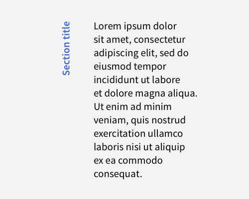
Rotate your section title so that it's vertical and place it to the side of your body text.
Obviously this makes your section title harder to read, so it's best to use this if it's not important for your users to read your titles, and when you value style over readability.
You can extend the "line" of the vertical title by adding a stroke below the title, or above it, to extend the "divider" effect it has.
One practical benefit of this technique is that you can widen the space that your text takes up, without making your line lengths longer.
Vertical text where the first letter of the text starts at the bottom seems to be easier to read than where the first letter starts at the top.
