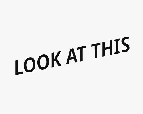
Set some text in italics, then rotate it so that the stems of the letters are vertically straight again.
This grabs attention, and is visually interesting (since it sweeps from bottom left to top right). This makes it good for titles.
This will generally make text harder to read, so you probably shouldn’t use it for body text or anything too small.
Also some typefaces will work better with this technique than others. The one I’ve chosen here, for example (Noto Sans) probably isn’t as good as it could be.
