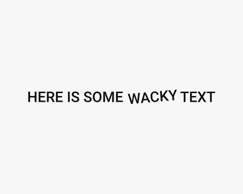
Rotate some text slightly.
This gives a visual design more personality through visual interest. It represents ideas like “funny” or “funky” or “wacky”, so it makes the visual design more approachable.
You can also tilt stand-alone text. It doesn’t need to be inline with other text.
You might need to tweak the layout a little because the tilted text will not align as well with the text around it.
The viewer might not know that the text is tilted if the effect is too subtle, or there are not elements nearby that make it clear that the text isn’t aligned quite right.
