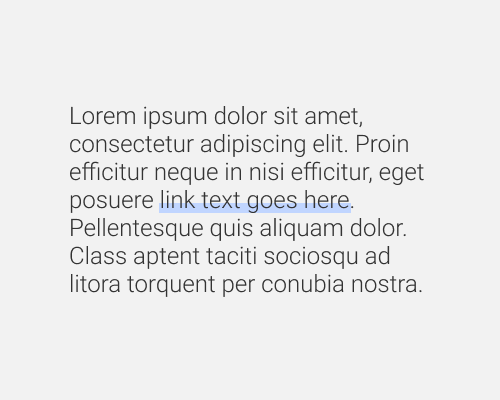
Add an underline to text, but make it very thick so that it overlaps the bottom of the text being underlined.
This is a way of styling link text, or underlining headings. The advantages are that it stands out more than a standard underline while still being an underline, and that it gives you a chance to introduce brand colours more.
If the underline colour does not contrast enough with the text, the overlap is going to make the text difficult to read. Having half of the text inside the colour underline and half of it outside means that the text is suddenly sitting on two different background colours, which can make it visually busy and hard to read, even if all of the colours are chosen carefully.