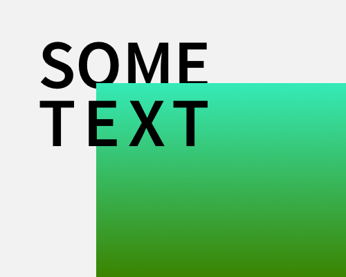
Place an element in the layer between two lines of text, so that one line of text is in front of the middle layer, and one line of text is behind the middle layer.
This is mainly useful for headings - you can make a heading and main image combination more visually interesting by combining them in this way.
The image will cut off part of the text in the background, so make sure you're not making the text hard to read. This is especially a problem if your text will be changing and you won't know what it is beforehand. You can see in the example below that the "E" could have been cut off so much by the image that it changed to an "F".
