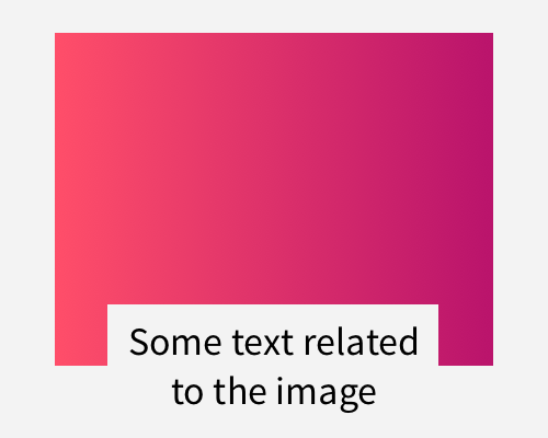
Place your text so it's overlapping the bottom of an image, and then cut the background for the text out of the image itself.
Using another element, like a block of colour, as the background for the text, can make the page appear more busy. Using a cutout like this means you take away "material", rather than adding it. This makes the page simpler, overall, but means that you can still read the text related to the image.
You're losing part of the image when you use this technique, so make sure that you don't mind losing it. This is especially a problem if the image is dynamic - if you don't know what image might load in that space. The image might have important information in the lower section, which will be hidden by the cutout.
