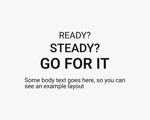
Create a stack of titles that get larger.
This plays the the sense of time and progression, because the titles are read one after the other and feel as if they get closer to the viewer through size increase. This is an energetic/interesting approach to titles. You can use it to represent feelings of high energy and anticipation, if they’re appropriate.
This takes up more vertical space. If the body text is small, the tall set of titles might feel out of place since they’ll be so much more visually heavy than the body text.
