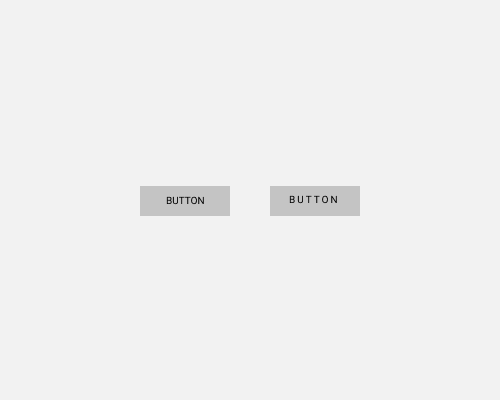
Increase the letter spacing between letters.
This is usually a good idea for labels on buttons, or items in navigation menus. It's especially important when you're using all capital letters, since their shapes are more similar to each other than lower case letters are. More space helps people tell the letters apart.
It's important to do this when the text is a small size, since smaller text is already harder to read.
You can increase the spacing more than you might expect. Try starting with a ridiculous amount of spacing and reducing it until it looks OK, rather than starting from what you consider "normal" spacing. This'll help you find something with enough spacing, and won't give you the sense that you're going too far.
