Enable features in your font that replace some glyphs with alternatives.
Many fonts come with alternative glyphs you can optionally enable. Often these alternatives are more stylised than the original. This means they work well in large titles and other areas of focus, where some extra style can go a long way.
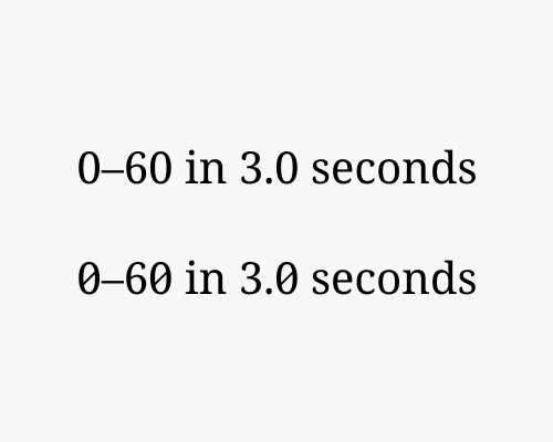
It’s a good idea to use these alternative glyphs especially if they are attached to the idea you want to convey in some way. In the example below the standard zeroes have been replaced with a crossed zero. The numbers in the copy are important because they relate to the speed of a car, and are the focus.
Sometimes alternatives glyphs might be distractingly stylised, so watch out that they don’t draw too much attention from the message.