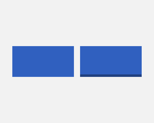
Add a drop shadow that is offset only on the Y axis, give it no transparency, and set it to a darker shade than the background colour of the element (Assuming a top-down light source).
If you want to give an element - like a button - depth, without making it look too realistic, this is a good way. You can do the same thing with a stroke instead, but if you need to use a drop-shadow for whatever reason, this is a good alternative.
If you're using a flat style in your interface, a shadow like this fits in well, but still gives things that "pushable" feeling.
Normally you should use a darker shade of the main background colour for the element. If you use a different hue, you run the risk of it not looking like a shadow.
