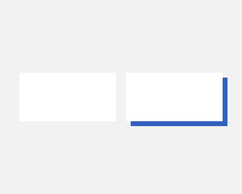
Apply a drop shadow to an element, give it a colour other than the one used on the element, and make it solid. Generally it's offset by the same amount on the X and Y axis.
This gives an element a retro feel, and also acts as a good highlighter - it's not really working like a shadow would, but it does almost underline the element and help it get noticed.
This also obviously adds a lot of contrast, at least to two edges of the element.
This is a very bold and eye-catching effect, so don't use it if your interface is meant to be subtle and restrained.
