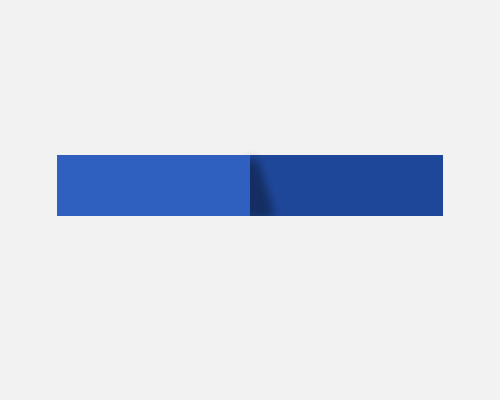
Add a sloped shadow with a blur between two elements where one is closer to the viewer than the other.
I noticed this being used for a row of tabs, where the "edge" of the tab bar was casting a shadow on the tab to its right. You could use this when you don't think a straight shadow will be clear enough in terms of users knowing that it's supposed to be a shadow, but I'll be honest that I don't see this very often, and don't see much of a need for it.
In the example below I gave the sloped shadow a slightly rounded top, and a blur. This gives it a softer, more natural feel.
This sort of sloped shadow might give the impression that the light source is hitting the elements from a strange angle, or that one element is leaning against the other.
