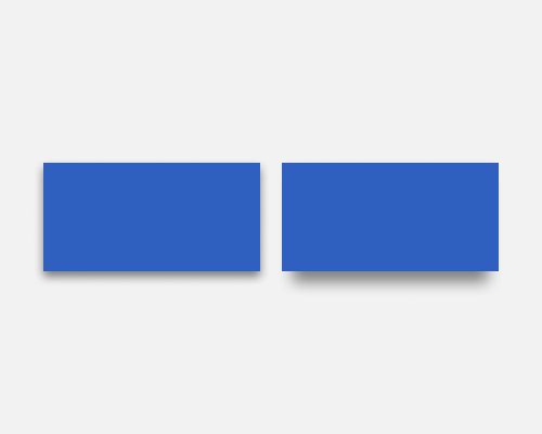
Duplicate a shape and place the duplicate behind the original. Set it to black, then blur it and perhaps increase the transparency. Alernatively, place a smaller shape behind the original shape and give that smaller shape a drop shadow.
This is quite a modern technique, and helps an element stand out, even if the effect isn't very realistic. This is an interesting way of adding depth to an interface, but I can't say much more about its advantages over a standard drop-shadow other than "People might like seeing it".
If the shadow is too much smaller than the original shape, it might look odd. In the example on the right below, the shadow was 90% of the size of the original shape.
