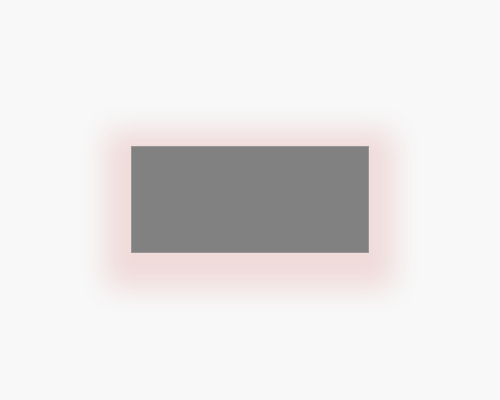
Apply a drop shadow and set it to a colour, rather than just black. Make the size of the drop shadow larger than the shape is comes from.
If you want to add brand colours to an interface, and want to make an element like a button stand out, a large coloured drop shadow is one way to do it. This is quite popular at the moment, and I think it has to do with the branding possibilities, the fact that more colours are more interesting - to a point - and that it doesn't stand out too much.
The shadow should be highly transparent, to the point that people might not realise it's there at first. Since you're using colour, it'll be noticed more easily than a shade of black.