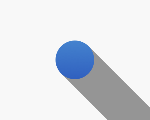
Add a shape that starts at an element, and extends away at a certain direction with the same width of the element. Generally it continues until it hits the edge of the viewport. Set the shape to a dark grey or similar colour.
Usually I only see this effect on logos, because the shadow extends to the edge of the viewport, so it's not very useful for the rest of an interface - you don't want a dark shadow cutting across your entire interface.
This became popular as part of the flat interface trend, because this sort of shadow is made of solid colour, rather than being soft and transparent, but still helps something stand out a lot.
Since drop shadows usually assume that the object is floating above the interface, unattached, if you have something that absolutely needs to appear like it's attached to the interface, this is one way to do it.
There's not an easy way to do this with most design software.
In real life the shadow would fade as it got further from the object, but that's even harder to achieve.
