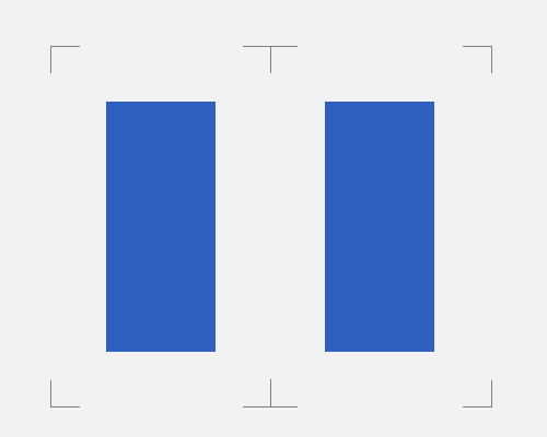
Mark out the edges of your layout, such as grid columns or blocks.
If you want to reinforce the layout you've used for a design, and more importantly make your design look a little futuristic and trendy, you can use subtle markings to show the edges of things like your grid columns and the blocks of content that you're using. In the example below, the two blocks of content are marked out at their edges, with margin taken into account, using subtle grey lines.
You could also use techniques such as including the grid columns you're using in the final design, as subtle columns of colour, but I don't see this technique used anywhere near as much as content block edge markings.
If you think you need layout markings like this, it might be because your layout isn't clear or obvious, and it's not going to be clear to users where one piece of content ends and another begins. Since these markings are more subtle that something like a divider, they might not help to make your layout much easier to understand.
These marks can be confusing, since they're subtle and usually not that close to the content itself. Make sure that it's obvious which content block or column they belong to.