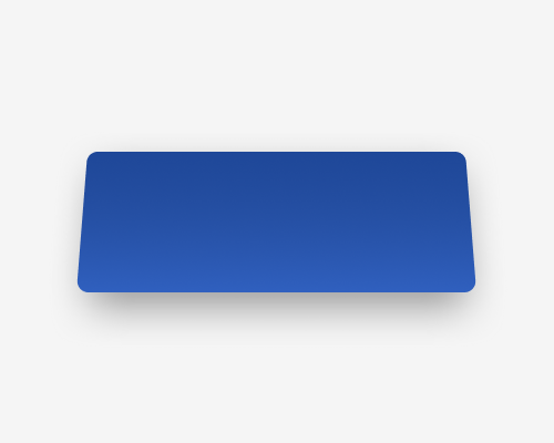
Make an rectangular element a trapezium, apply a dark-to-light gradient, and give the "more raised" edge a drop shadow.
This visual effect makes an element look like it's tilting, so if you want a 3D effect from 2D, this is an option. You could use this to make an element seem as if it's "facing" other elements on the page.
The element does not have to be facing upwards, as in the example below. You could use the same methods to make it face any direction, by changing which side has the dark end of the gradient and which side has the drop shadow.
The gradient is subtle enough that it is hard to notice. Play around with the settings until it looks realistic.
