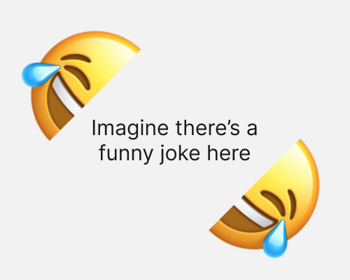
Split an element, such as an image, into more than one piece. Put those pieces in different parts of the design.
If you only show half an element, a person will naturally feel satisfied when they come across the other half. This can help if you want to put the equivalent of book-ends around content.
Unlike in the example below, this technique might be better with subtle split elements, so that the strange sight of half an image doesn’t distract from the content.
If the parts of the element are too far away from each other, the viewer may not realise that they belong together, so there’s a balance to strike in terms of distance.
