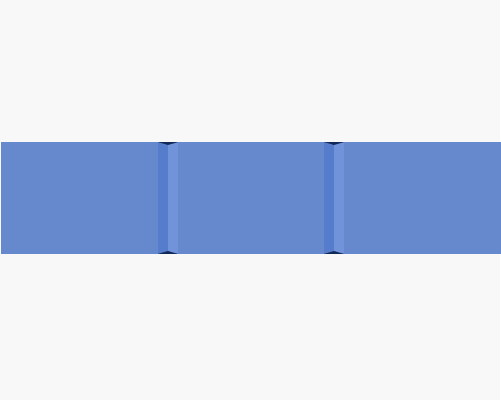
Put a lighter and a darker rectangle next to each other on a background area, and add dark triangles to the top and bottom of the rectangles.
If you want to divide an area like a navigation or toolbar, and want something more interesting than a straight line, you can use this technique to make it look like the background of the element is popping out. The triangles at the top and bottom show you what's behind the "material" that's popping out.
The triangle height needs to feel right in terms of how much the material would be popping out from the background in reality. You'll have to judge this by eye.
You can make the triangles the same colour as the background behind the element that these are popping out of, since that's probably what would be under the element if it were a real surface. I haven't done that here so you can see the triangles clearly.
Try different widths for the rectangles which form the sides of the pop-out area. The narrower the rectangles, the further out it will appear to be popping.
