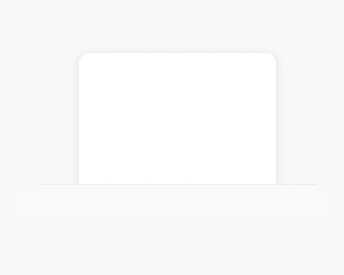
Add a line to the bottom of some imagery, and apply shadows to suggest that the imagery is poking out of a cut in the background, or appears to be inside a pocket.
This is mainly a visual interest technique. You could use it if you wanted to suggest that your brand is "cute", since pockets are cute.
The shadows don't need to be very strong to give the right impression. In the example below I've also added a very slight shadow above the horizontal line, to suggest even more that it's a pocket. I've seen this technique work without this line, though.
Obviously if the imagery is appearing to slip behind the background, some of it will need to be cut off. You might need to find a way to suggest that there's more content inside the pocket, without having to hide useful things down there.