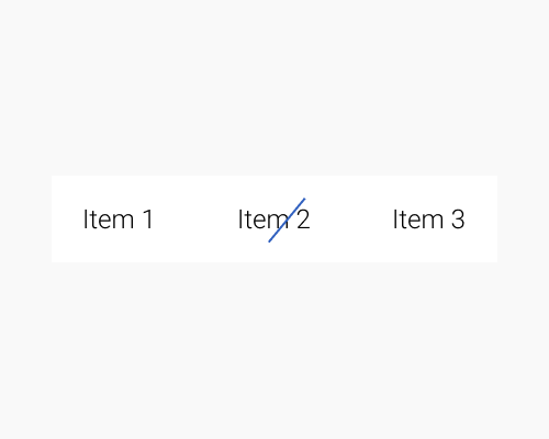
Put a shape or line over the selected item in a menu.
If you want to signify that an item is selected, as in a navigation menu, but you don't want to do what everyone else is doing, you can do this. It adds visual interest, and looks sort of "messy" in a modern way. In the example below I've used a line at an angle, but there's no reason you couldn't use any other shape.
If you're using a shape other than a line, you might want to make sure the shape is an outline only, or take other steps to make sure the text isn't covered up so much that the user can't see what is selected.
If you have random shapes dotted around your interface, such as background motifs, the user might assume that whatever shape you've chosen for your selected menu item is also part of the motif, and not know that it signifies something.
