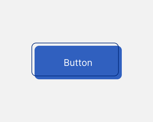
Create an element with a background and a border and offset the two so that they don’t line up.
This adds some visual interest to your design, and can help reinforce a brand which doesn’t follow the rules. It’s still a clean effect, though, so it strikes a nice balance.
This element might be hard to align with others. You've got two “parts” which sit on different grids (the background and the border).
