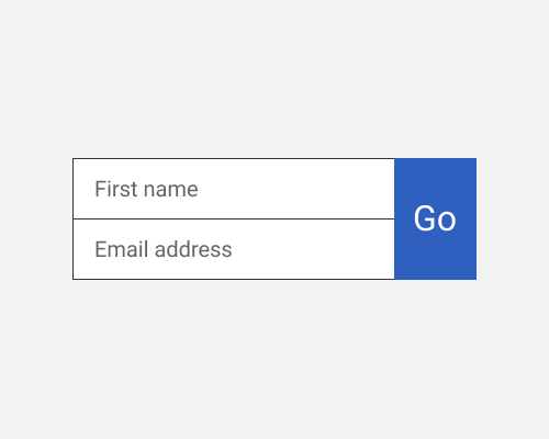
Create a form submission button that is the full height of the form fields it submits.
This is best for short forms as you can probably imagine. In the example below it's a simple two field form - perhaps for an email newsletter sign-up. This approach is visually interesting, compact, and fits neatly into layouts.
You could use this for a longer form but it might look silly. You could also try to do it with spacing between each of the fields and the button but I make no promises that it'll look good. There's always a chance that your user will not know this is a button since the pattern is unfamiliar and you don't get a lot of space on the button itself to have a long label.
