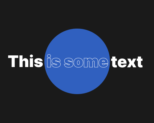
Where an element overlaps with a different background, change from a fill to an outline, or vice versa.
I most often see this when text is laid over a background image. But you could use it for other elements. It’s mainly useful when you don't want to cover up the background too much.
With some combinations of background and foreground element, this might not work well visually.
