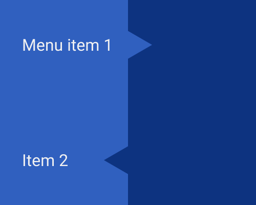
Use a shape like an arrow to connect two areas of an interface such that the arrow visually "spills" from one area into the other.
If you have two areas that have a parent-child relationship to each other - like a multi-layered navigation - you can use an arrow to visually connect them. If it's navigation, the arrow can line up with the navigation item that the user selected. This way, it's creating a direct visual relationship between the item they selected and the second navigation area that is "created" as a result.
This approach stops the divider between the two areas of navigation feeling too separate from each other.
Note that the two arrows in the example below are alternatives - it's best to use one or the other, not both.
The shape doesn't have to be a triangle, but it's probably helpful if the shape suggests movement in some way.
The shape will naturally get in the way of layout because it takes up space that a straight-line divider wouldn't.
