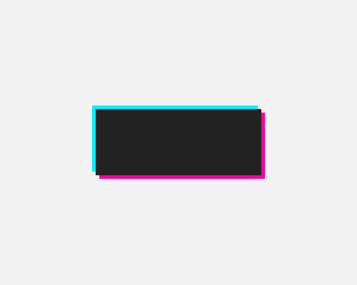
Put solid drop-shadows behind a shape in opposite directions, and colour them with complimentary colours.
This adds visual interest, and is a chance to use brand colours if you happen to have complimentary colours in your palette. It also helps a technological/futuristic theme.
It's best to keep the shadows close to the main shape to get the right effect. Since the shadows are solid they might interfere with layout/alignment.
