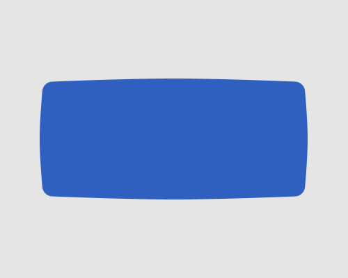
Bend the edges of a straight-edged shape slightly so that they bow outwards or inwards.
This is mostly for visual interest. It gives the interface more soft edges, and therefore makes it look more friendly or approachable. You can use it for buttons and element background shapes, among others. In the example below I bowed the edges only 5 pixels away from their default straight position.
Straight edges work very well for grid-based layouts. Bowed edges might look strange, especially if your elements are laid out in a grid - visual alignment won't be as strong.
If you're using bowed edges on elements like buttons, it might confuse your users, who may not be sure if it's a button. They're used to straight edges and specific shapes meaning specific things.
