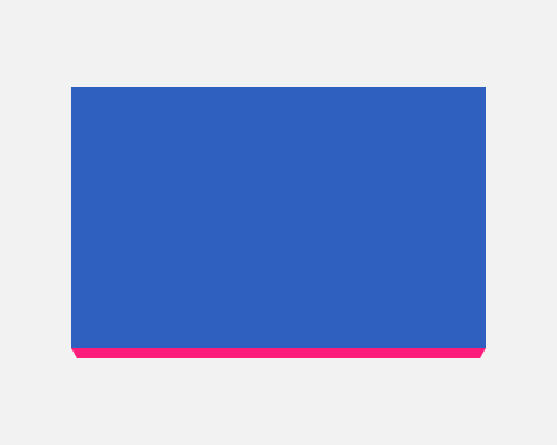
Add a shape to the bottom of a container with angles on each side to represent perspective/the vanishing point.
This is bolder than a drop-shadow, and suggests depth more than a straight-edged shape at the bottom. It’s a chance to use a different colour for the edge, as in the example below.
The example below uses 45 degree angles. You might want to play with the angles to make sure it feels 3D, but if the angles are wrong the effect might be lost.
Because this adds extra height to an element in a solid way, it'll affect layout.
