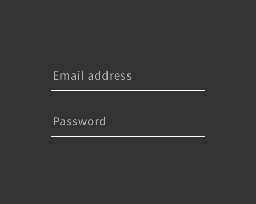
Put a stroke along the bottom edge of a form field, and nowhere else.
If you want a minimal signifier that an element is a form field, you can use just an underline. This is quite common in Material Design, though in the most recent style guide they suggest that form fields also have a filled background colour.
This is quite risky, because apart from Google's Material Design, there aren't a lot of standard form fields that use this style. Your users might not realise that they can fill the element out.
One thing that can help a lot is to always provide a placeholder in the field, which will give another clue that this is what the element is.
