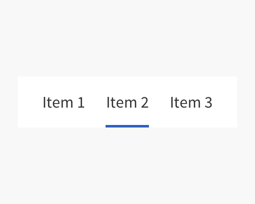
Add a line below or above a menu item when it is the selected item.
This is an easy way to add some colour to an interface, like your brand colours. It'll help to highlight which menu item is selected, but isn't as visually heavy as changing the colour of the background of the selected item, for example.
If the line is too thin, or too far away from the selected menu item, your user might not think they're related, or might not notice the line in the first place. It should also be a colour that will stand out and be noticeable.
Usually the line is the right length for the menu item - that is it takes up the same width as the text at least.