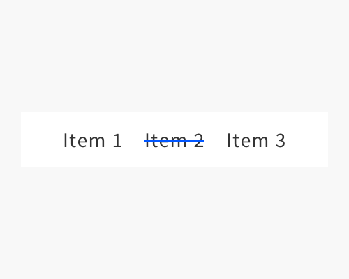
Put a line through the text label of the selected item in a menu.
I've seen this mostly in "stylish" sites that are trying to win awards, so if you're creating a stylish site and are trying to win an award, think about using this technique.
It's probably best to combine this technique with something else, like colouring the element that's selected, to give more clues about its state.
Another reason to use this is that it takes up no more space than the menu item itself, so if you really don't have any space to work with, this might help.
Crossing out an element that is selected, when selection is a positive state, doesn't make a lot of sense, so watch out for this technique not making a lot of sense to your users. To be fair, as long as the selected element is the only crossed out element, and there are enough other elements in the menu that the user can get a good sense of the "default" style, they should realise eventually why this element is crossed out.
If the line is too thick it might make the label hard to read.
