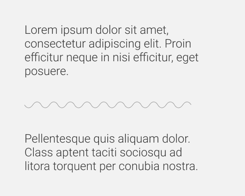
Put a squiggly line between two elements/areas.
If you want to divide two areas and want it to look more interesting, make the divider squiggly. You can do more than just "round" squiggles. Try sharp ones. Generally this should match your brand if you're going to do it.
This is not very easy to do in design software, and might be just as difficult in code. You could always use a transparent image, but resizing it depending on viewport size etc. might still be tricky.
