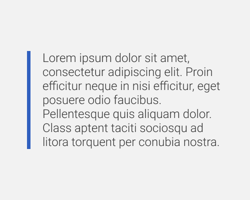
Put a stoke on one side only of some text or other element.
If you don't want to make an element too heavy but want to highlight it in some way this is a good approach. It lets you add some colour to a design without needing a big block of it and you can make the stroke as thick as you want if you need more emphasis. It helps a lot with text, especially if you want the text to align with the main content but still be highlighted, as this stroke can be run in the outside margin so the text is still left aligned.
If the stroke is not obvious enough and the content it highlights is still aligned with the body content, people might not notice that it's supposed to be different in some way, for example with a block quote.
