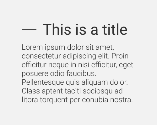
When showing a heading or title on the page, put a line to the left of it (In left-to-right languages)
This technique mainly adds visual variety to a design, so use it if you're lacking any interesting quirks, and want some. Since it's a line, the longer it is, the more it acts as a divider separating the next section from the previous.
The left edge of the title text won't align nicely with the left edge of your body text. Feel free to shift the title to the left and have the line hanging into the left margin, if you've got the space. This way it'll feel more like a bullet point.
