Put a line between two elements or areas that you want to separate visually.
Using lines as dividers is very easy to understand, since most people are used to lines being used in this way. If you want to make it very obvious that two areas or two elements are separate, especially if they're close enough that a user might not be sure, using a line can work well.
Using a line can be a bit visually heavy in some cases. Other methods like using a background colour transition, or making sure there's enough whitespace between two elements, can work just as well and look cleaner.
If you want to stick with lines, remember that you can make them very subtle, and they can still do the job. Look at the lines in the navigation bar example, second from the bottom below. They're nearly the same colour as the background, but they stand out just enough to visually separate the menu items.
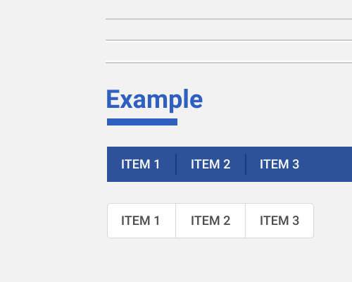
If you're using lines to separate sections inside a container, like in a navigation bar, menu, or button group, you'll need to be careful about whether the lines stretch all the way to the edge of the container, or leave gaps on either side. If you leave gaps, it can suggest that the content is still related, but different enough that it needs to be separated. If there is no gap, those areas feel less related. No gaps is also most suitable for a group of connected buttons, like in the final example below.
Your line doesn't have to be 1 pixel thick, and flat. In the examples below you can see a convex and concave divider, made by using two lines of lighter and darker colours. You can also see a thick, short divider that almost acts as an underline for the title "Example".