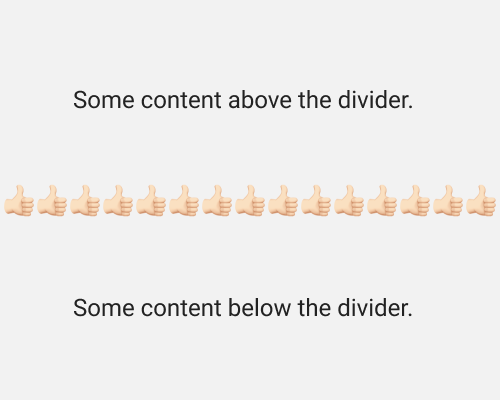
Create a divider out of graphical elements rather than lines.
This is a good chance to reinforce a brand concept or to add some personality to your visual design. I’ve used a thumbs up emoji in the example below, but you can use any graphical element you like.
Depending on the graphics used, it might not look like a divider. It’s best to make sure that when you squint at the divider, it still feels like a solid line which divides two sections, as that is it’s reason for being in the design.
