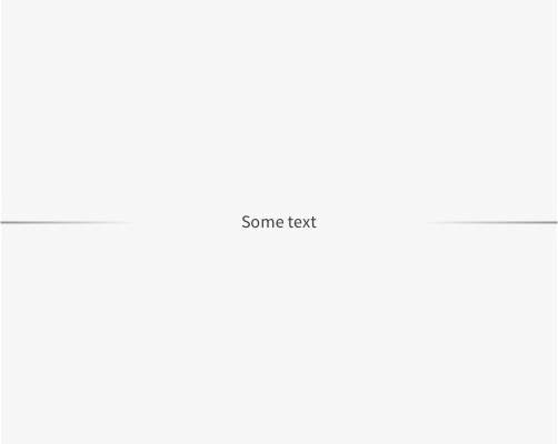
Add a divider between two sections, with a label, but fade out the dividing line either side of the label before they get there.
If you want a divider with a label, but want it to be less strong than a solid line, you can fade the dividing lines as they reach the label. This obviously divides the two sections less, since there's more of an opening, but it also feels less heavy on the page. It suggests division, rather than enforcing it. I'd say it's also a bit more modern looking, if that's something you want.
The dividing lines end up looking a little space age, like lasers, in my opinion. This might not work well with your brand or style, so use carefully. Also the fact that you've got less division, as written above, means you shouldn't use this if you want the divider to be obvious. I'd argue this falls more on the "style" than "function" end of the spectrum.
