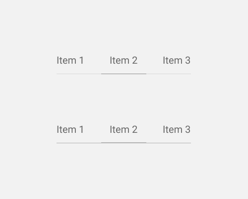
Put a faint line below a set of tabs, and emphasise the section of the line that belongs to the selected tab.
If you want your tabs to be very light visually, you can group them together using the line below all of them, and then emphasise the part of the line that matches up with the tab that's selected by the user. This needs no background rectangle to show the tabs, nor does it need extra graphical elements to show which one is selected since it uses the existing line.
In the example below, you can see two methods for emphasising the line section: changing the colour (In this case it's darker), or changing the thickness.
Depending on the colours/line thickness, this method might make it hard for users to know that they're looking at tabs, since there are very few signifiers to tell them that.
