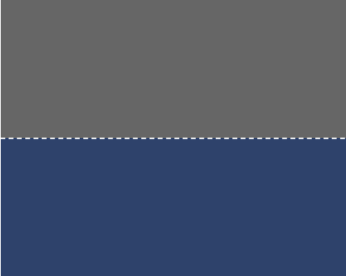
Add a dotted line between two areas of a design to divide them.
This technique is useful if you want to add some visual interest to a design, remind users of a "cut here" line from print design, or divide two things but let them bleed into each other a little, since the line is not solid.
Make sure the background colours for the two areas that you're dividing have high enough contrast with each other. A dotted line will not increase contrast between two areas as much as a solid line.
