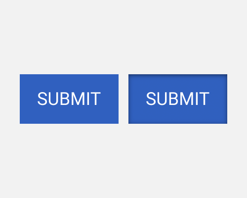
Apply an inner shadow to an element, offset downwards, assuming a top-down light source.
If you want an element like a button to appear to be inset into the page because it was pressed in, an inner shadow is a good way to do it. This is because the top edge, which would normally be flush with the button, is now overhanging it, casting a shadow on the button itself.
You could also apply this style to elements are are toggled in or out, like a button that you press in and it stays in until you press it again. I don't see this style of button very often, though.
The shadow doesn't need to be very strong to give the right effect. Try to keep it subtle, unless you have a reason not to.
If the element is not very obviously a button, it might be mistaken for something else like a field, since this technique is also used there to show that an area can be filled in. However, usually this style is only applied temporarily while a button is being pressed in, so it shouldn't be too much of an issue.
