Overlay text with a gradient that moves from fully transparent at the top to whatever the background colour is at the bottom.
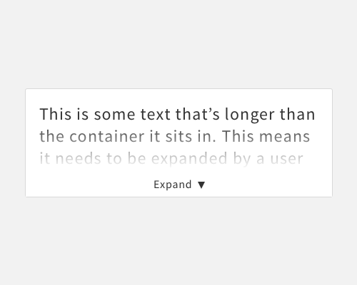
If text inside a container of some kind is expandable, so that the user can reveal more text, it's important to make it clear that this is possible. Otherwise the user might assume that there's no more text to read. One way to make this more obvious is to apply a gradient to the bottom of the text, so that it fades away. This gives the impression that there's more of it.
If you're not working with much text, applying a gradient fade might not be a good idea, since there won't be much text to go by for your user to decide if they want to expand the content.