Add more stops to a gradient and set the colour and transparency so that the gradient changes more smoothly.
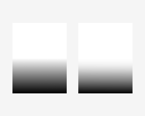
Some gradients make their transitions obvious. In the left example below, there’s a standard white to black gradient. You can easily see the place where the black starts.
One way to avoid this is to ease the gradient. In the right example there are six gradient stops instead of two. The hue and transparency levels have been set manually for each so that it appears to be a much smoother transition.
There is probably a mathematical way to work out the right hue and transparency settings for each stop in the gradient, but I do not know them. So you will need to work them out by sight.
