Apply a gradient from fully transparent to a mostly transparent dark colour between an element's foreground, like text, and its background.
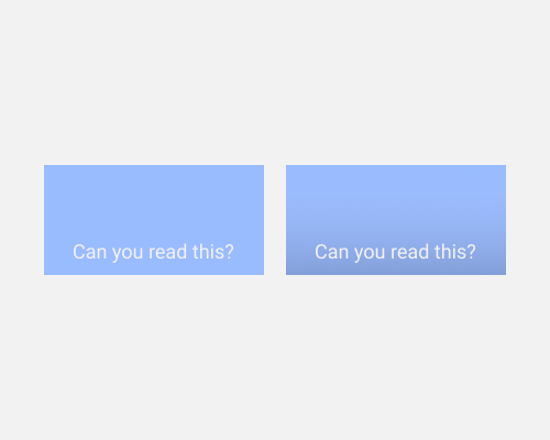
If you have text overlaid on an element, but there's low contrast between that text and the element background, you can add a subtle gradient layer to increase the contrast without distracting too much from the background. If the darker colour you're using at the bottom of the gradient is transparent enough, it'll be hard to notice.
You might be tempted, if you have text near the top of an element, to use a gradient that starts with a dark colour and finishes fully transparent, but this will be more noticeable. We're used to seeing things darker at the bottom, because most of our light sources are top-down, so we hardly notice when something gets darker there. But if something starts darker, it can look unnatural and stand out immediately.