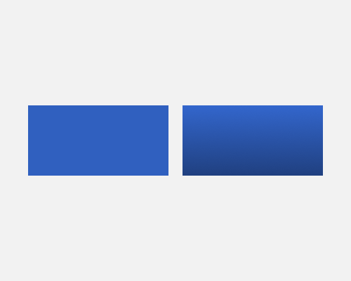
Apply a gradient to an element, moving from lighter at the top to darker at the bottom, assuming a top-down light source.
If you want an element to appear to be bulging out of the interface at you, like a button, a gradient helps with that. This can make buttons look more pushable, for example.
A gradient also makes an element look more interesting, and if it's a subtle gradient, many people won't notice that one has been applied at all.
There generally doesn't need to be too big a difference between the lighter and darker colour in a gradient. Keep it subtle.
